Typography
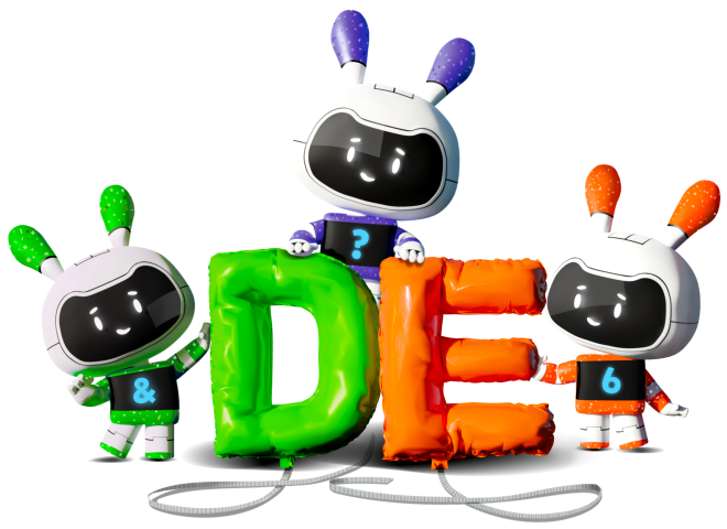

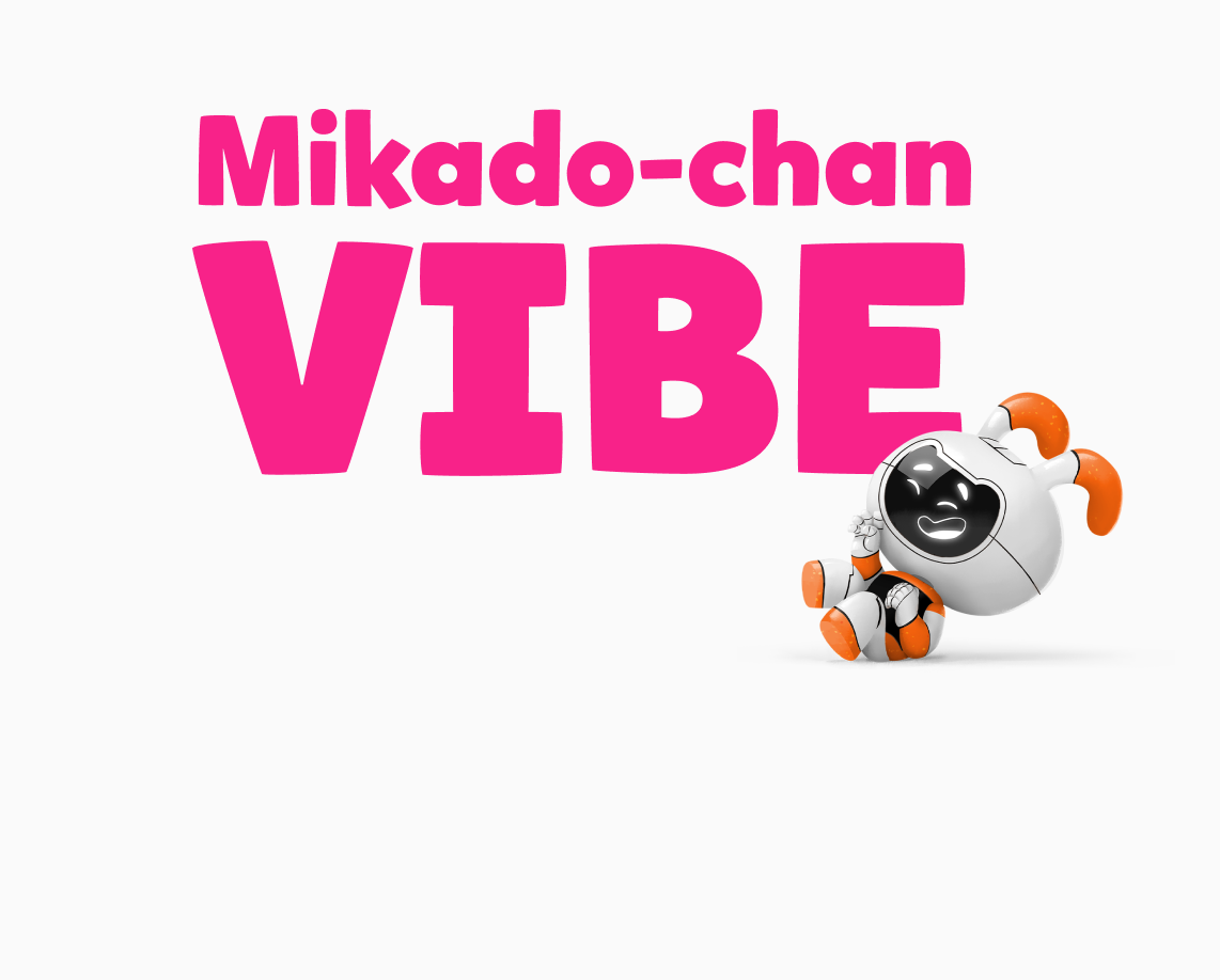
We use a combination of two main fonts: Proxima Vara, and our own early learner font, Mikado-chan.


Mikado-chan is a customized font that was designed with the way young learners are taught to read and write in mind. Discovery Education owns the exclusive rights to Mikado-chan, which is a variation of the existing font, Mikado.
Mikado (帝): King or Emperor
Mikado-chan (帝ちゃん): Little King or Child King
Designer: Hannes von Döhren, in collaboration with our Sr. Designers Joyce Tai-Chau and Alexandra Corona

Mikado-Chan Available Weights
Mikado-chan is available in six weights: Light, Regular, Medium, Bold, Black, and Ultra.
We use Regular for paragraph copy within lessons and Bold for headers. Light, Black, and Ultra should only be used for editorial design products such as informative web pages, packaging, and marketing design.
Mikado-Chan Light
Mikado-Chan Regular
Mikado-Chan Medium
Mikado-Chan Bold
Mikado-Chan Black
Mikado-Chan Ultra
Mikado-Chan Recommended Styles
Mikado-chan is primarily used in student content for Grades PreK–2. There is a limited range of recommended sizes available because the text needs to be large and readable.
Jumbo
Size: 140px
Line Height: 115%
Weight: Black (900)
Title
Size: 80px
Line Height: 120%
Weight: Bold (700)
Header
Size: 70px
Line Height: 120%
Weight: Bold (700)
Body Copy
Size: 40px
Line Height: 135%
Weight: Regular (400)
Caption
Size: 25px
Line Height: 120%
Weight: Regular (500)
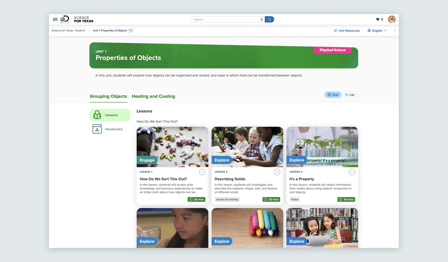
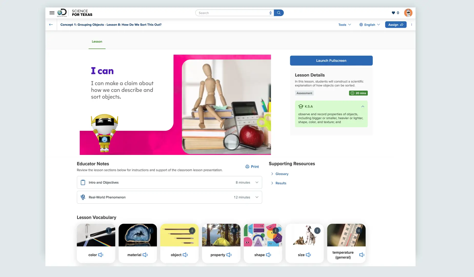
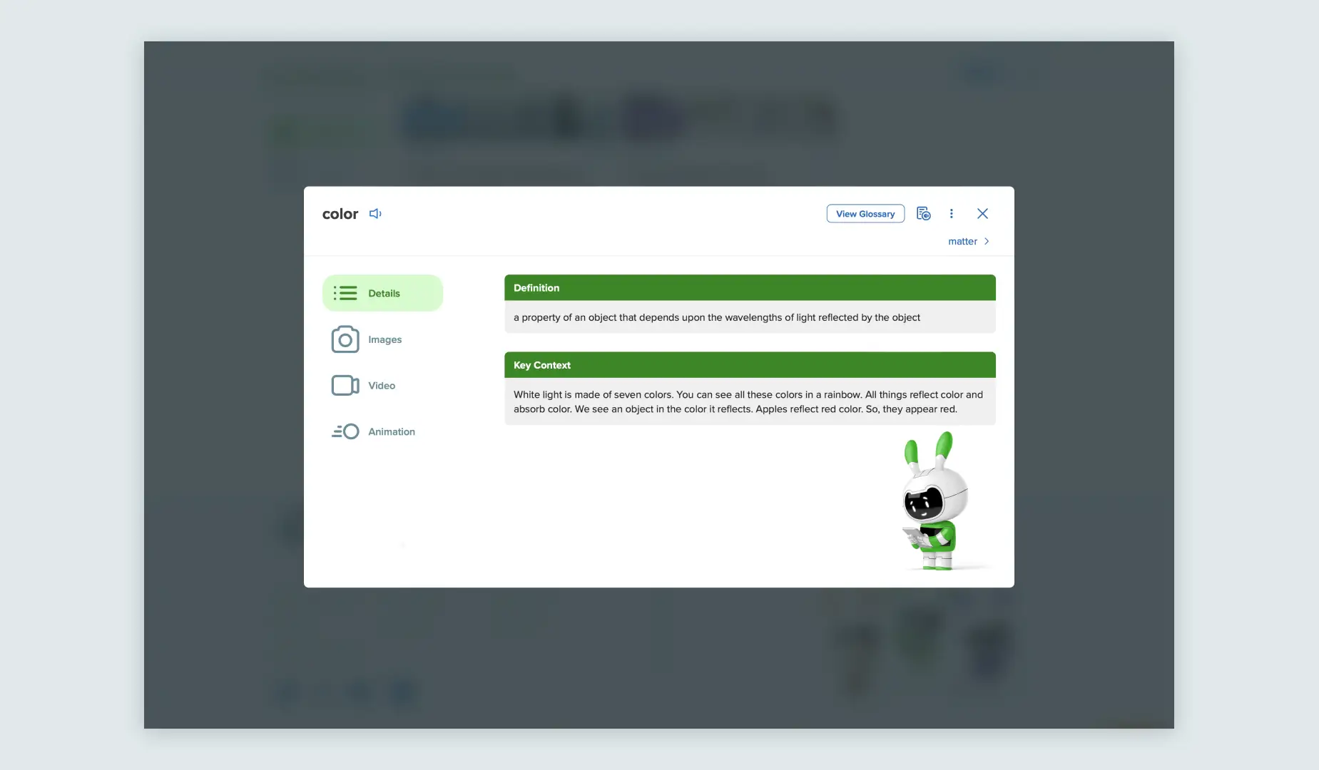
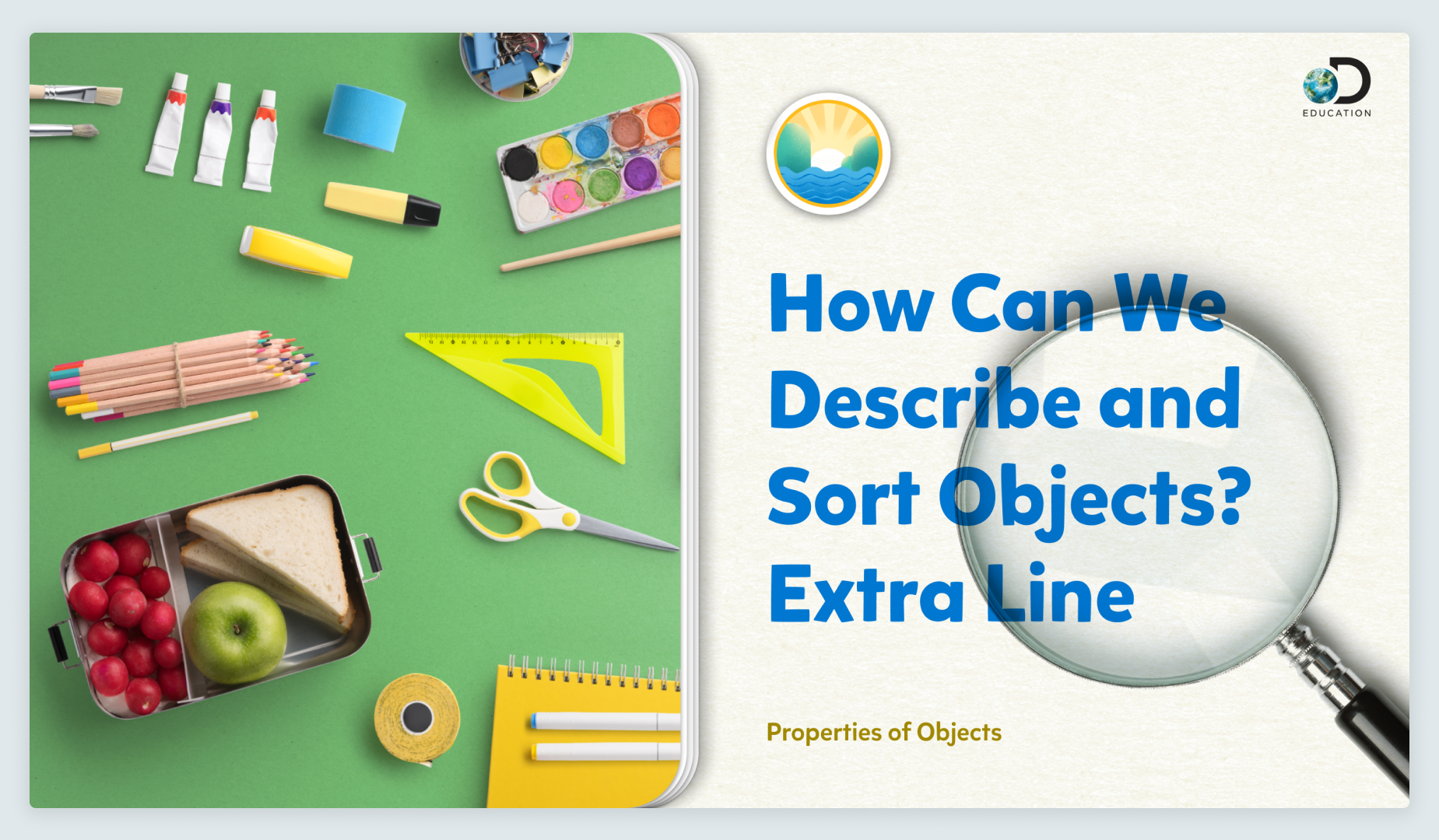
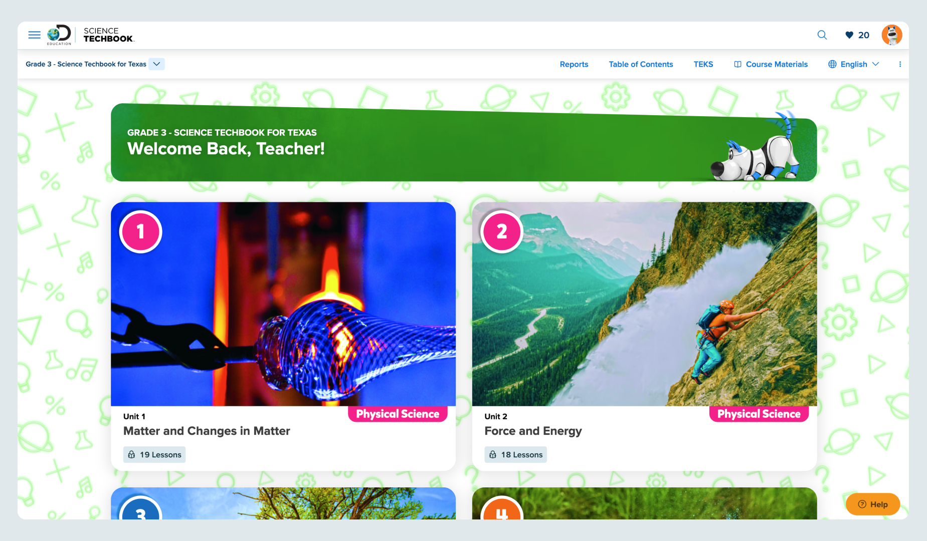
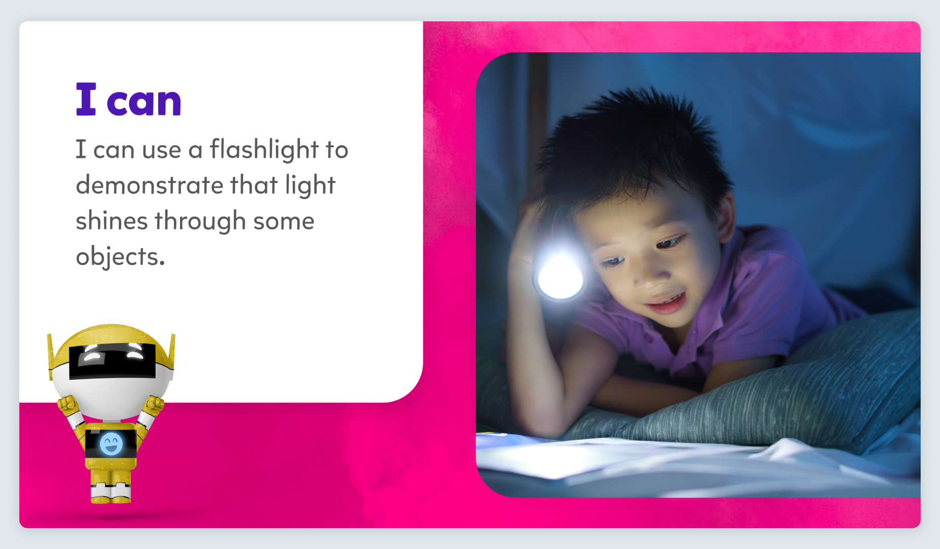
Mikado-Chan Examples in Lessons
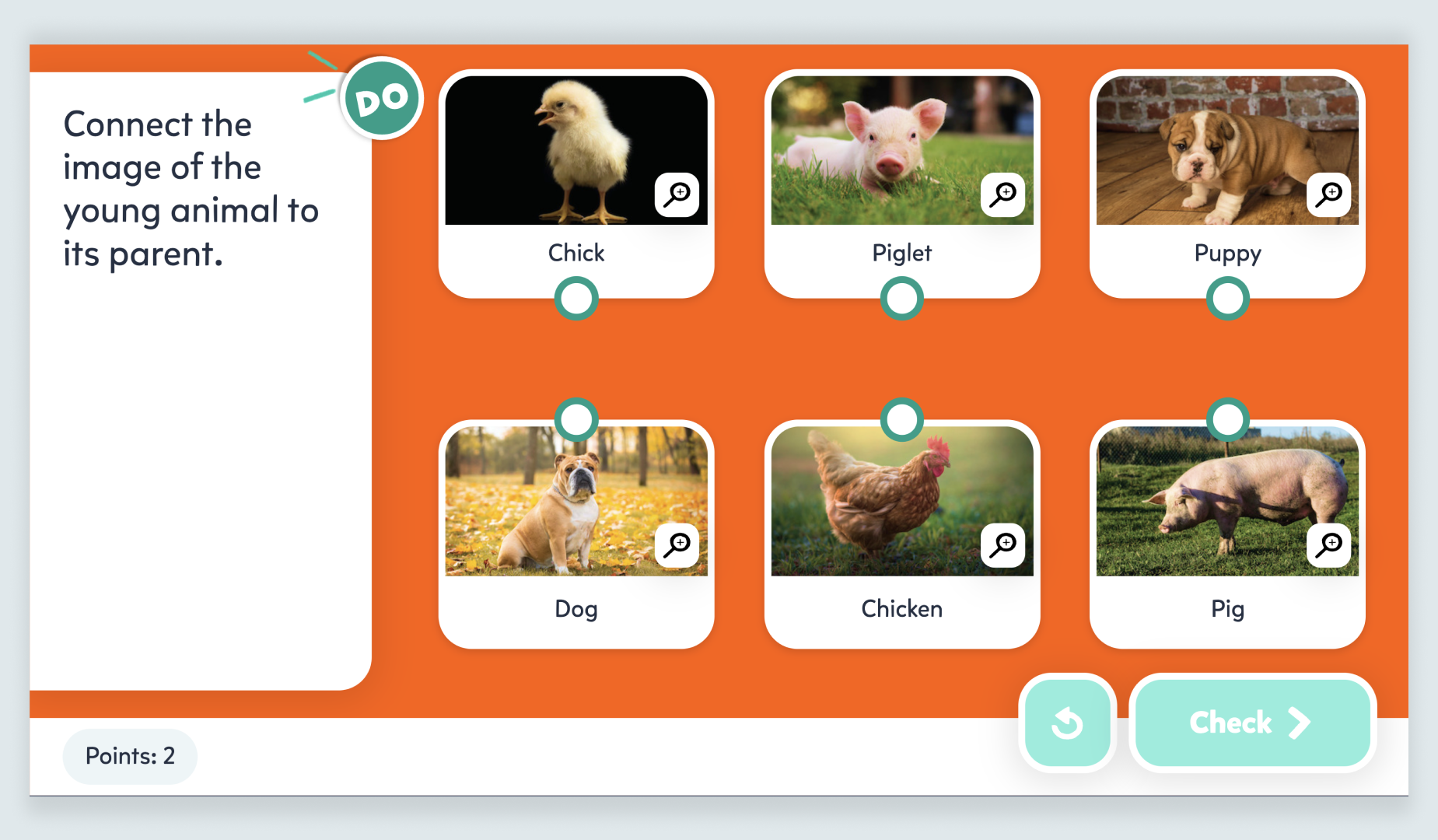
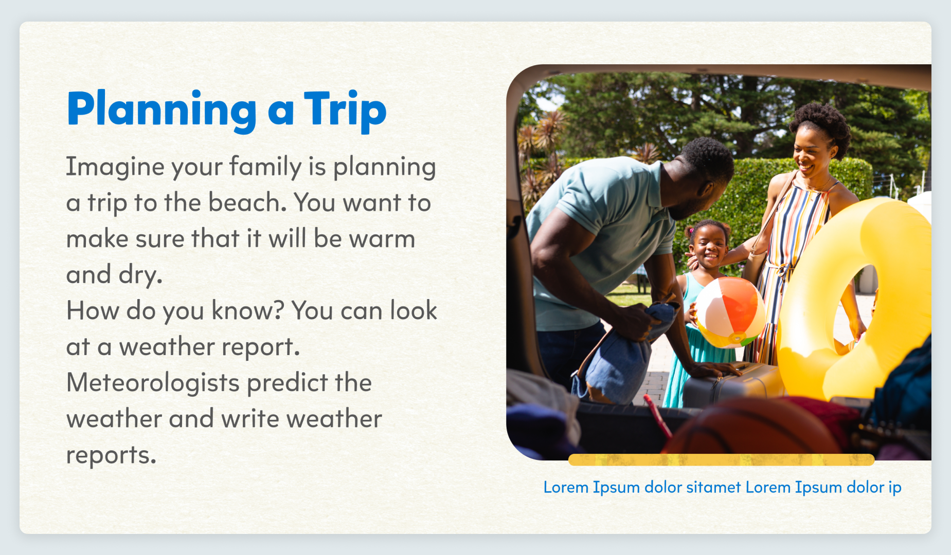
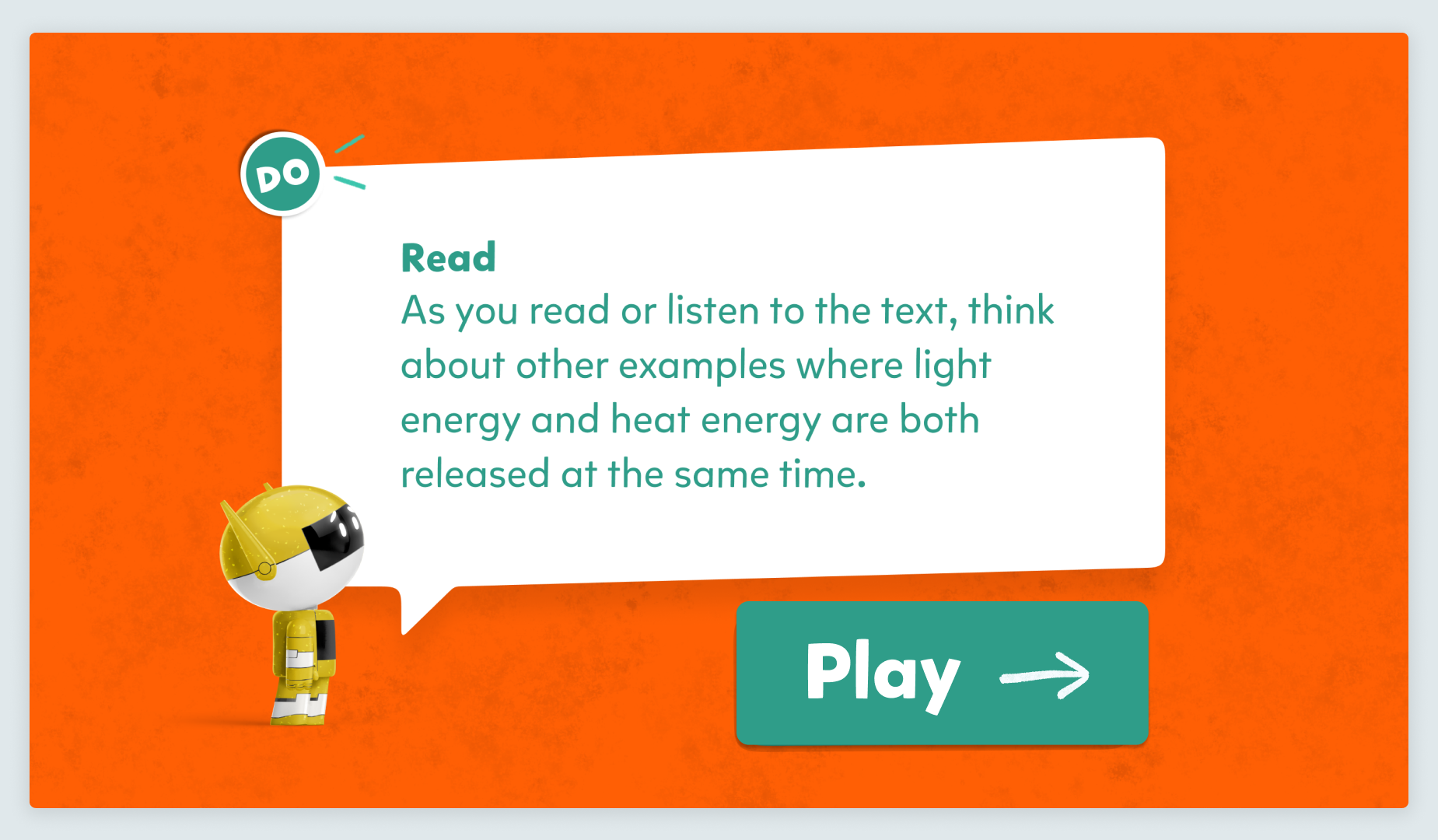
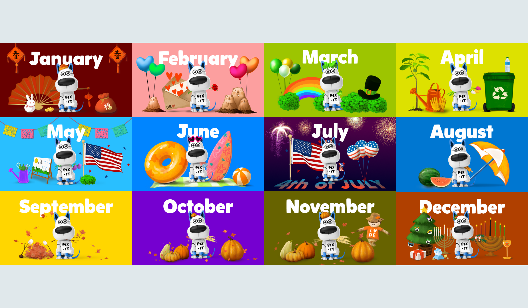
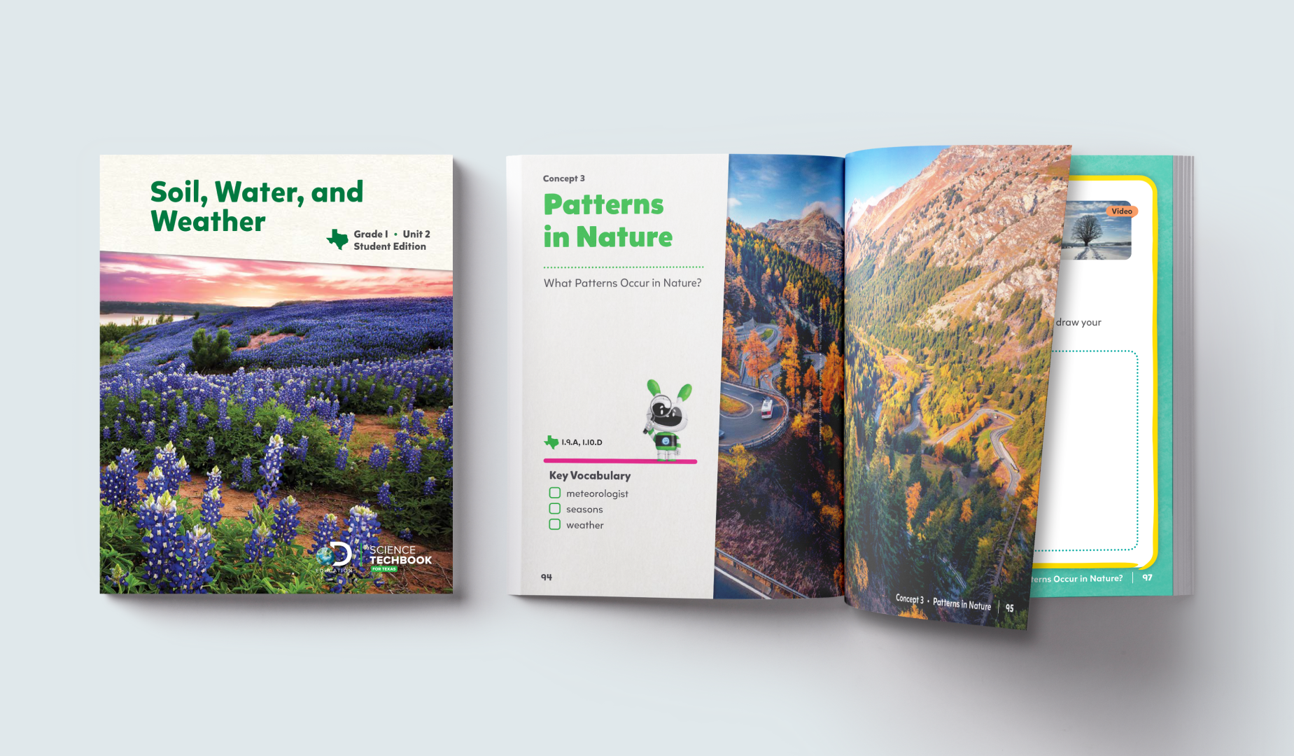
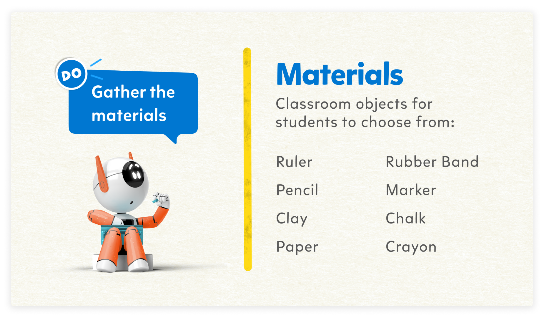
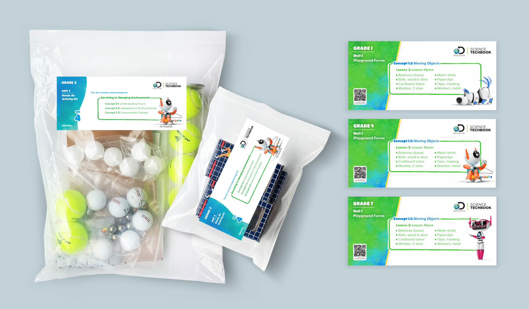
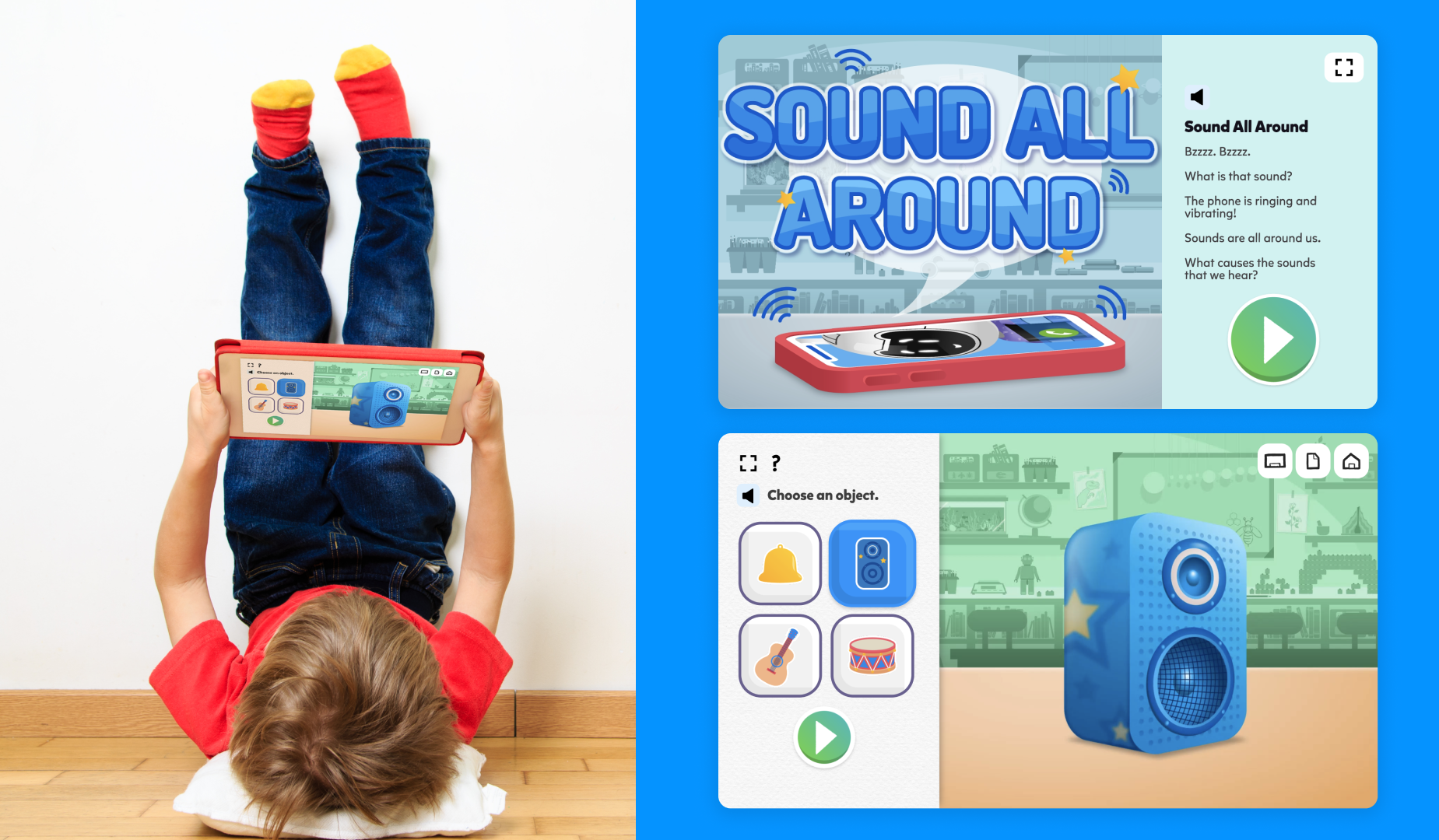
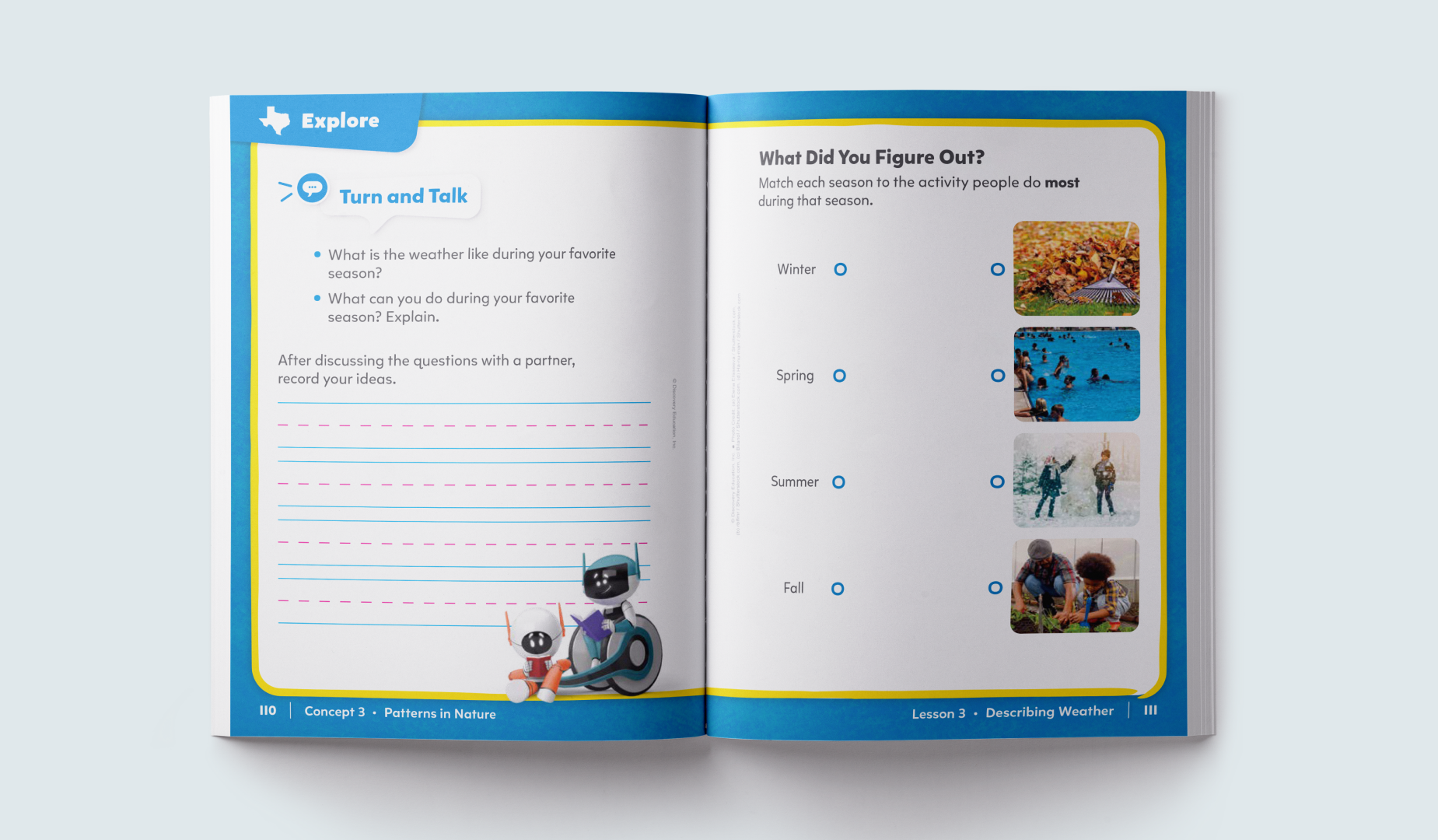
Type and Color
Both Mikado-chan and Proxima Vara use Platform Neutral 800 for paragraph or body copy, but rules around headers differ.
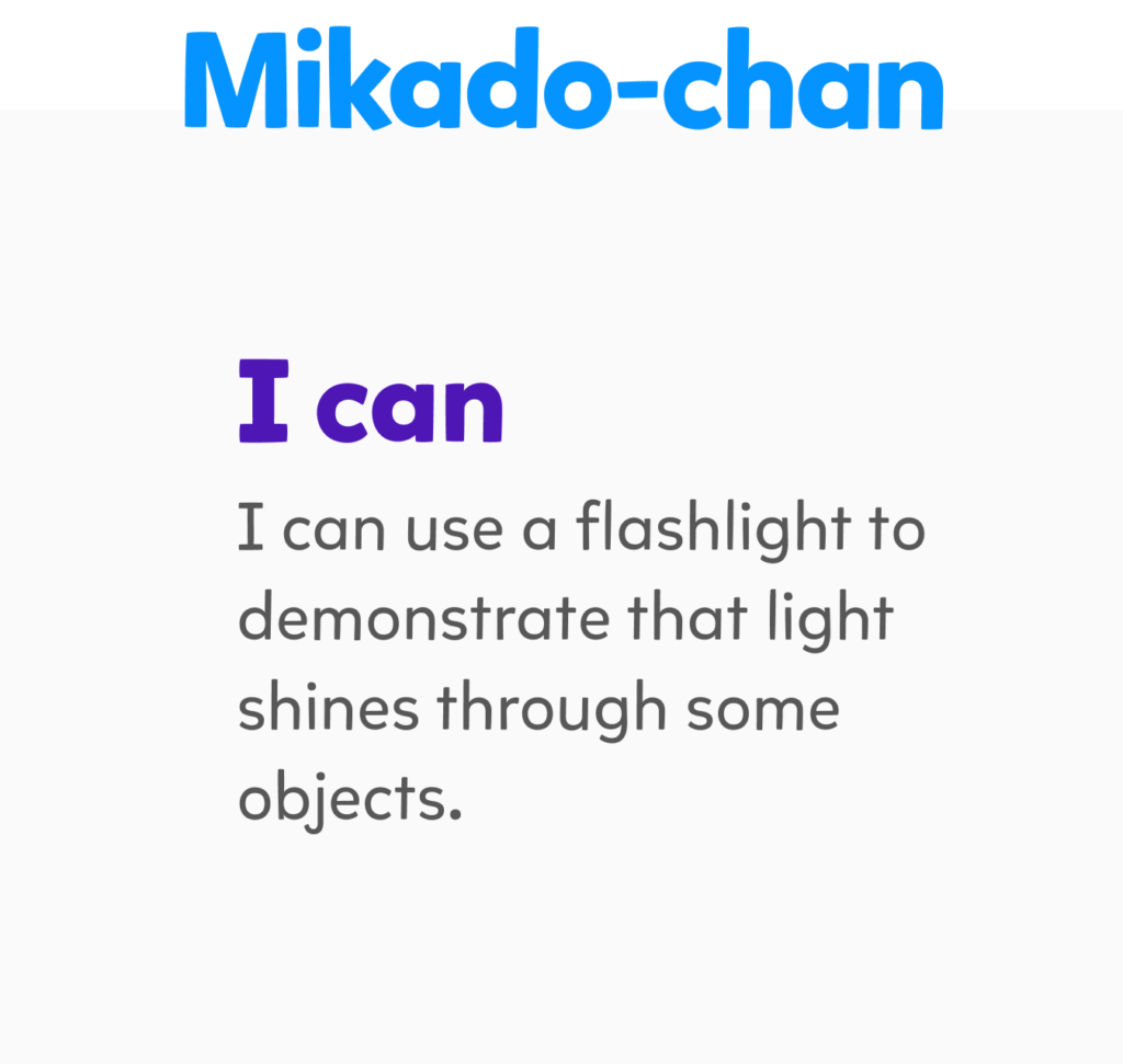
Header: Color exploration is encouraged for grades PreK-2. It must pass passing AA accessibility standards.
Paragraph Copy: Platform Neutral 800
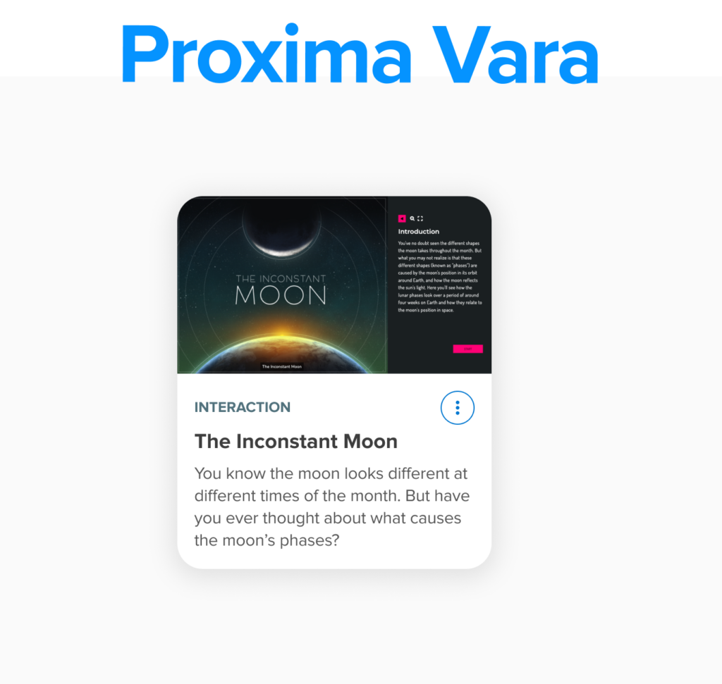
Header: Platform Neutral 900
Paragraph Copy: Platform Neutral 800
Proxima Vara
Proxima Vara is an exciting new addition to our font family. It is a versatile and flexible typeface that builds upon the success of our previous typeface, Proxima Nova. With Proxima Vara, we have expanded the range of weights, widths, and slants available to our designers. This allows for greater creativity and customization when it comes to creating effective type hierarchies for different design needs and use cases.
Proxima Vara Regular
Proxima Vara Semi-Bold
Primer Vara Bold
Aa Bb Cc Dd Ee Ff Gg Hh Ii Jj Kk Ll Mm Nn Oo Pp Qq Rr Ss Tt Uu Vv Qq Xx Yy Zz 1 2 3 4 5 6 7 8 9 0 ! @ # $ % ^ & *

Sizing
Predetermined sizes for all headings and body copy establish a clear hierarchy in our typography. This guides a user’s attention to different sections of our interface. We have also included specifications for tracking and leading to enhance readability and ensure a pleasant reading experience.
Headings
H1
Regular, Bold
120% Line Height
H2
Regular, Bold
120% Line Height
H3
43px
Regular, Bold
120% Line Height
H4
35px
Regular, Bold
120% Line Height
H5
28px
Regular, Bold
120% Line Height
H6
24px
Regular, Bold
120% Line Height
Body
Body 1
18px
Regular, Semi-Bold, Bold
140% Line Height
Body 2
16px
Regular, Semi-Bold, Bold
130% Line Height
Small Captions
14px
Regular, Semi-Bold, Bold
140% Line Height
Specifications
Tracking
Leading
Leading (line height) when using Headlines stays fluent at 120% throughout, while our Body type(s) various between 130% to 140% when being used.
Usage
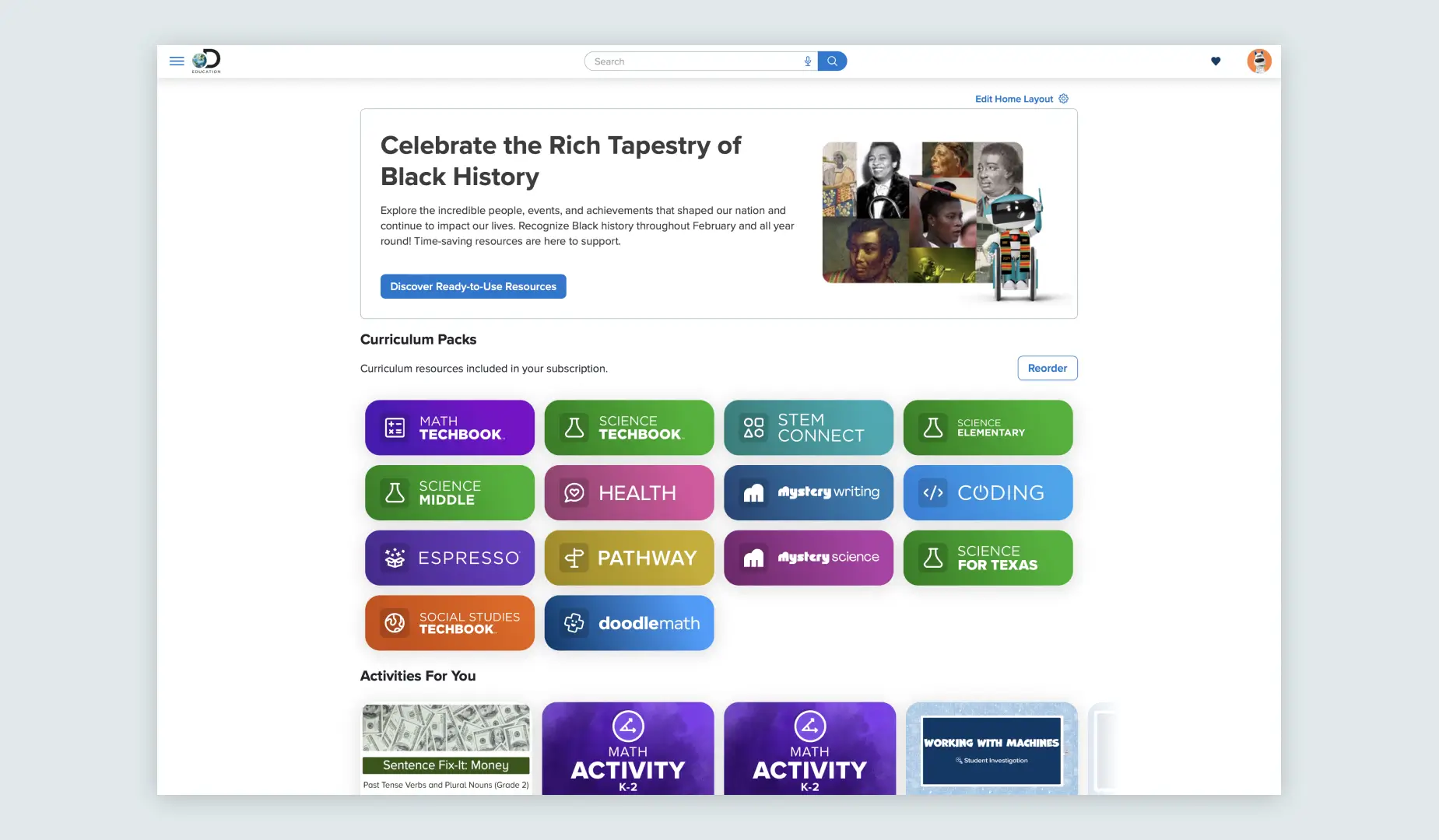
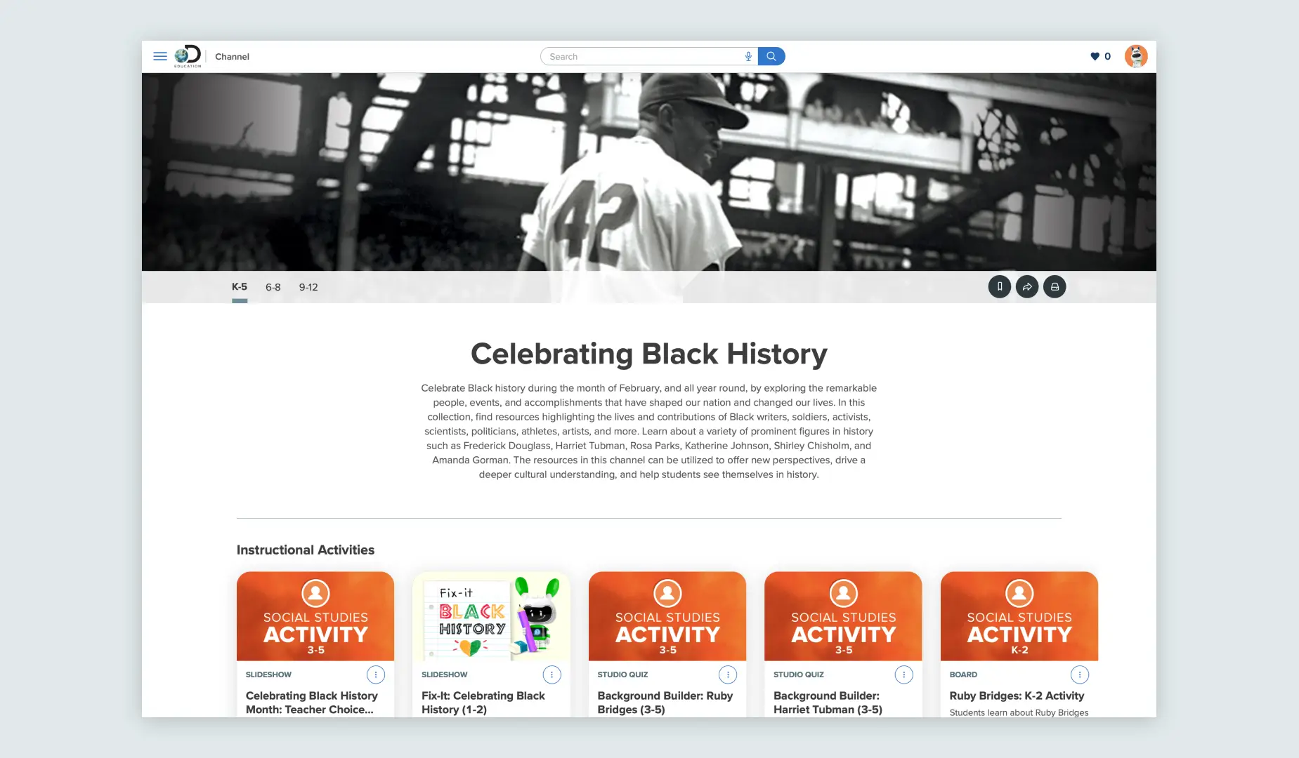
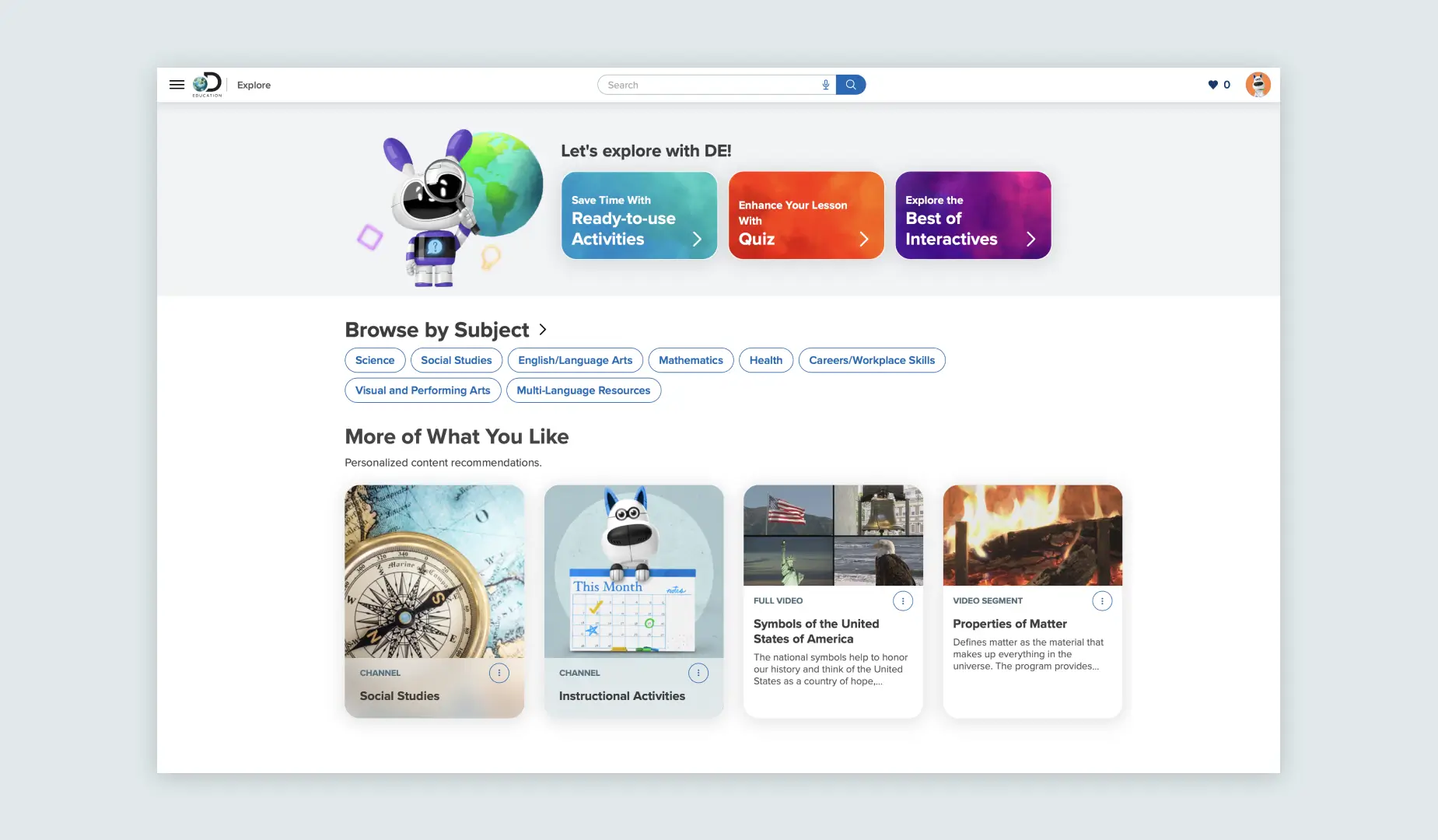
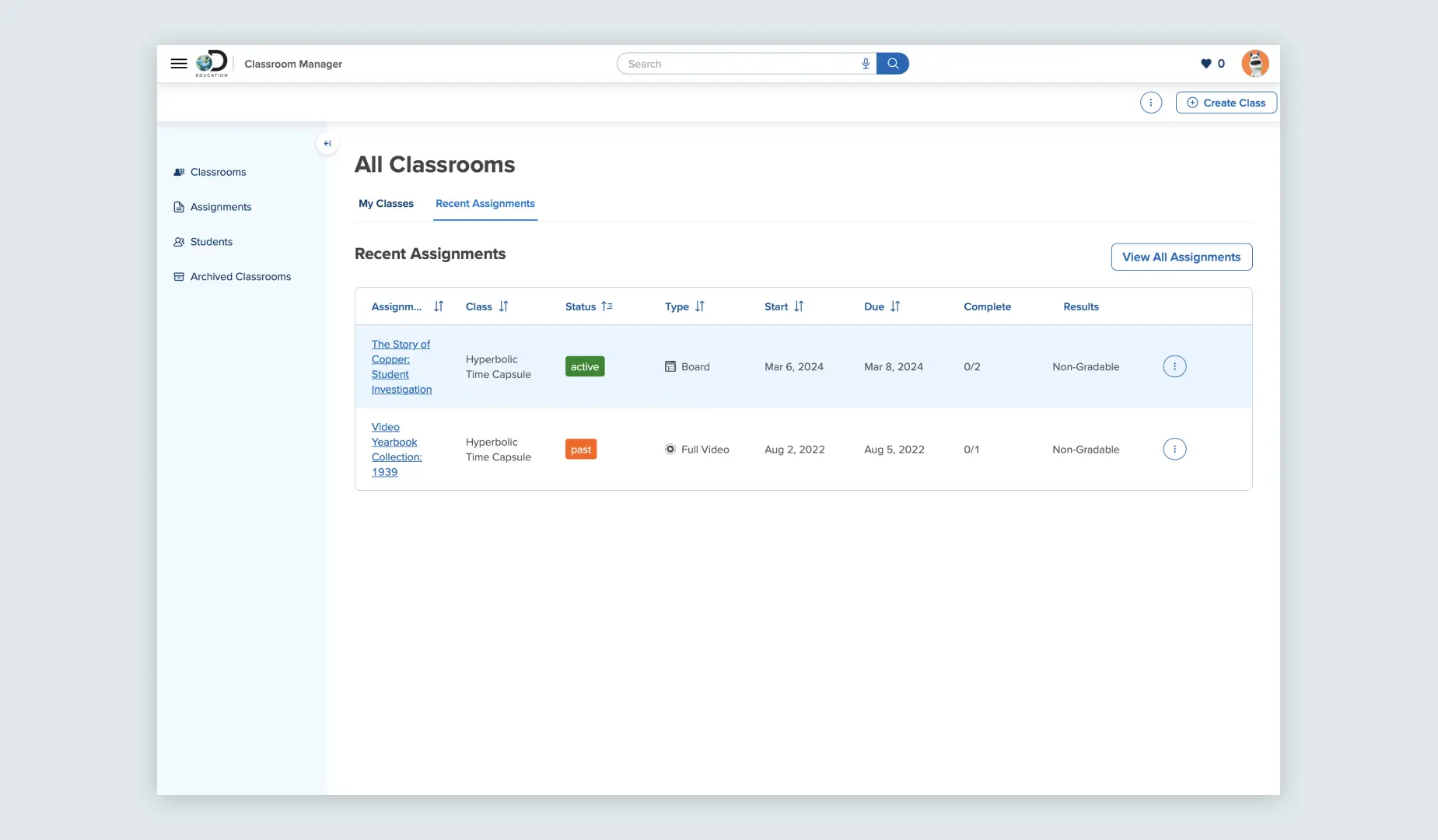
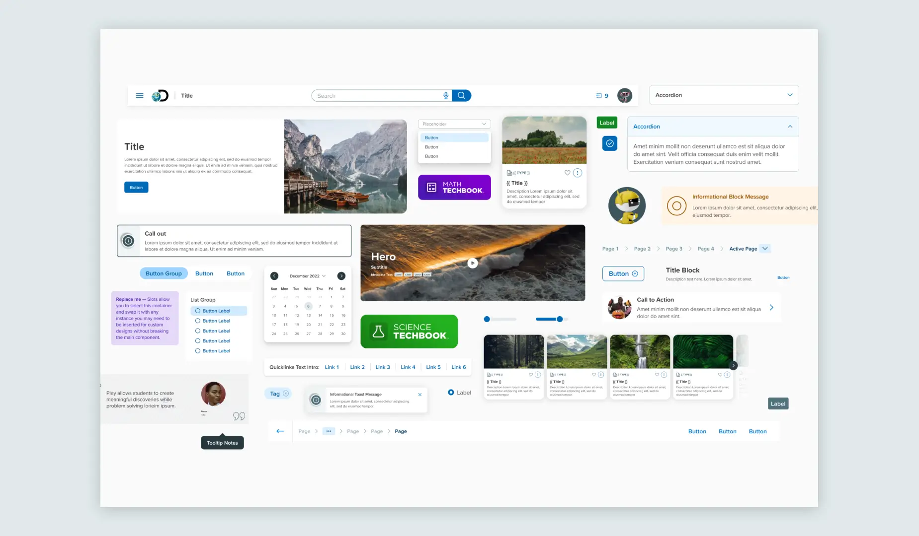
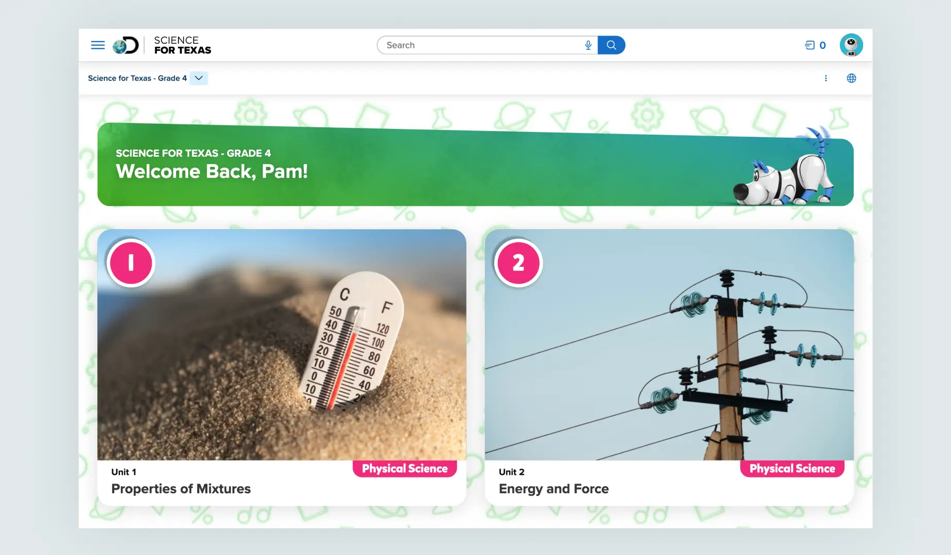
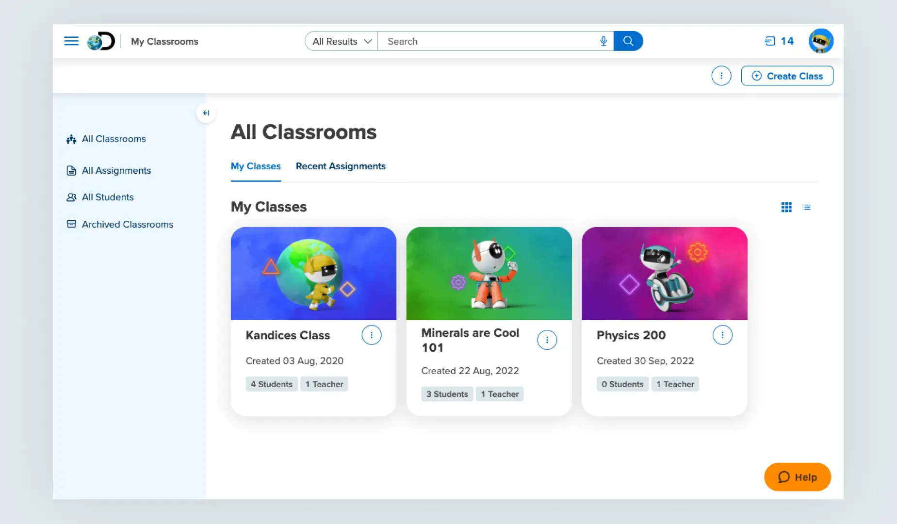
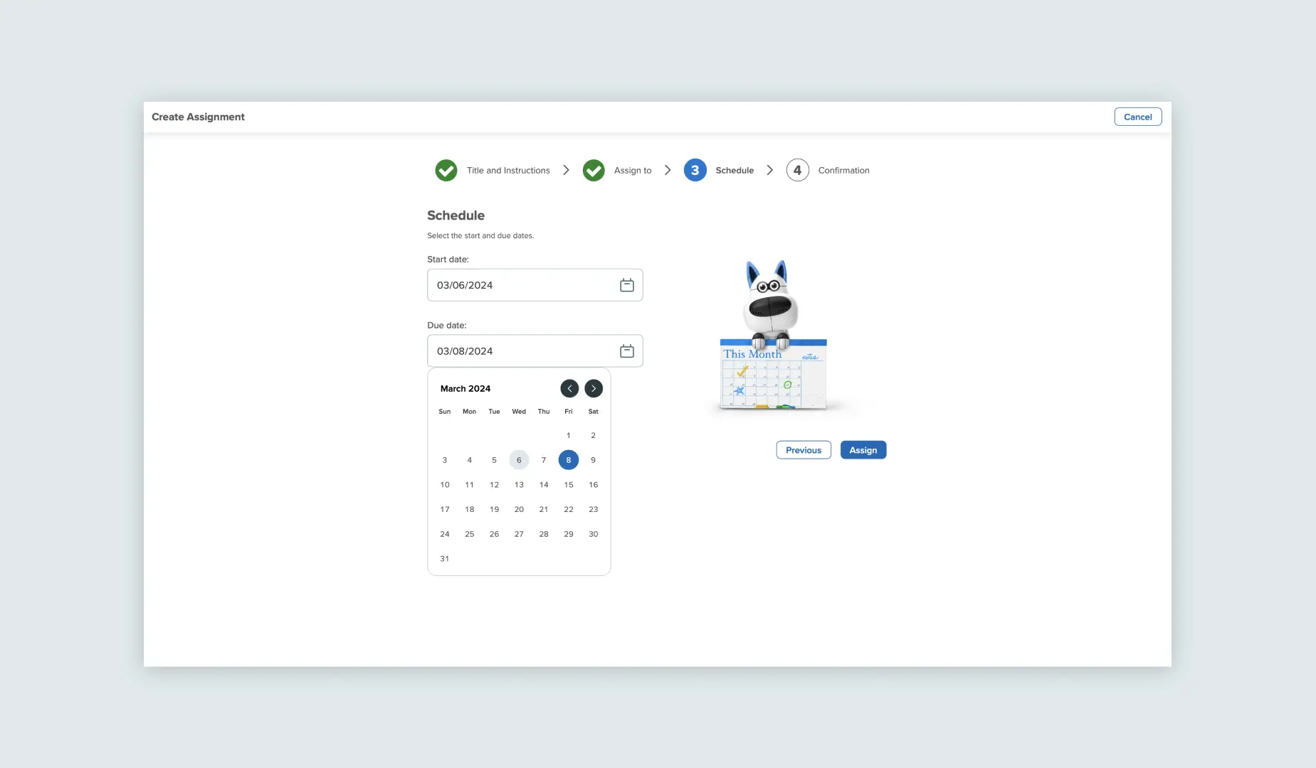
Below, find the specifics of how we set up interface core components to work seamlessly with our Proxima Vara typeface. Through careful alignment and integration of design principles, Proxima Vara ensures a visually appealing user experience.
Examples of Proxima Vara in Product
