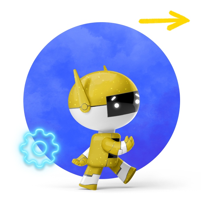
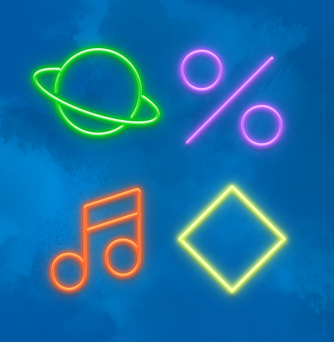
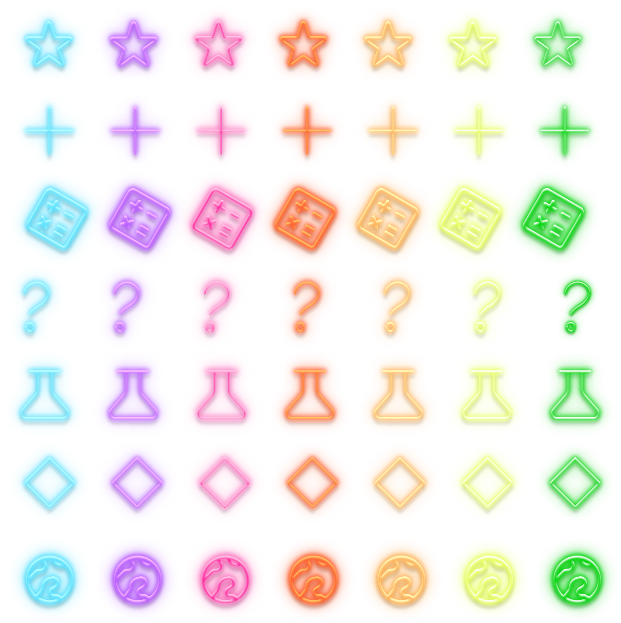
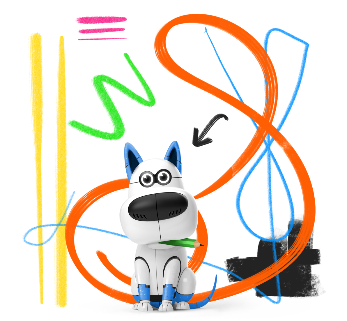
Neon accents can add a little extra energy and color to your layout. They shine best over top of a darker background. They are colored per subject matter, but all colors can be used across product lines, especially when doing a subject-agnostic design.
You can grab all Neon Elements from the Nebula Library in Figma by searching “neon.” If you find yourself in need of a new icon, just reach out to the Visual Design Team with a request.
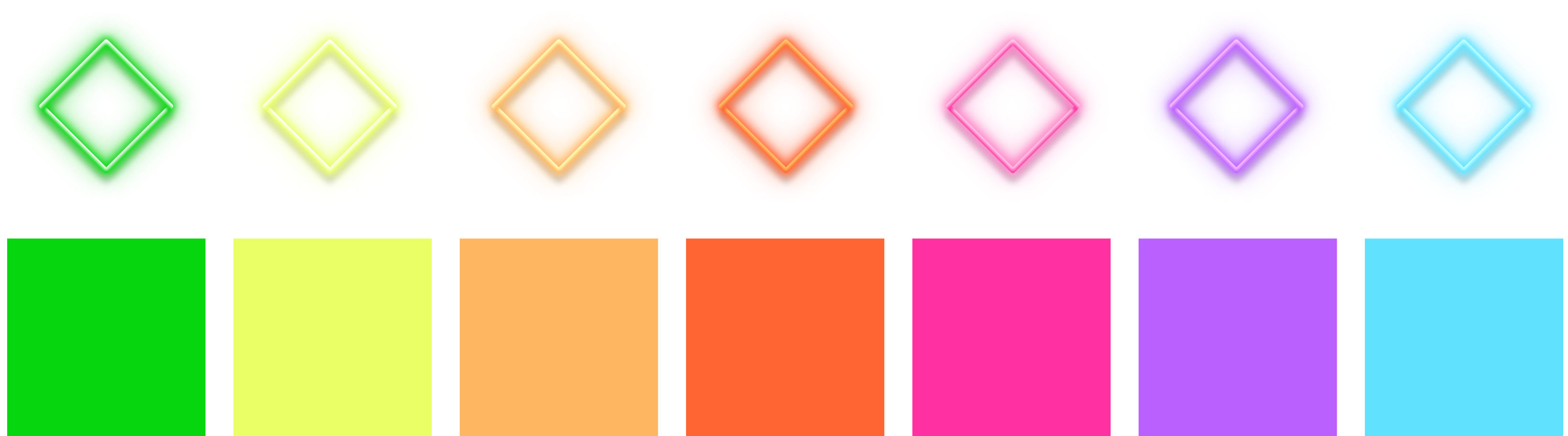
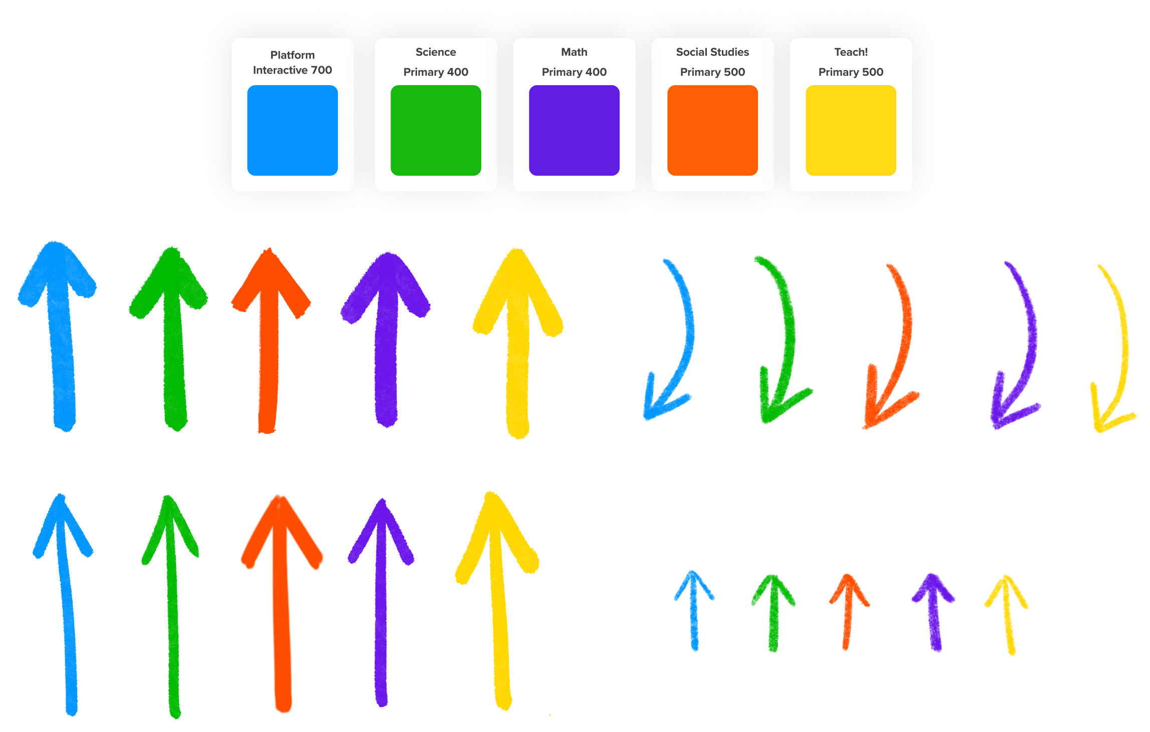
Colors
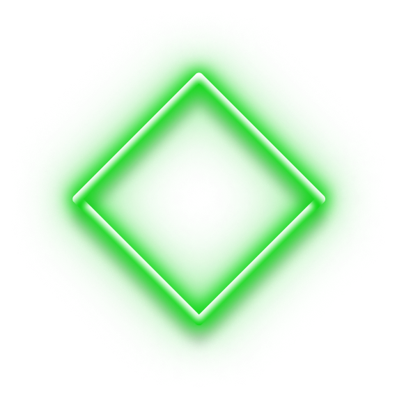
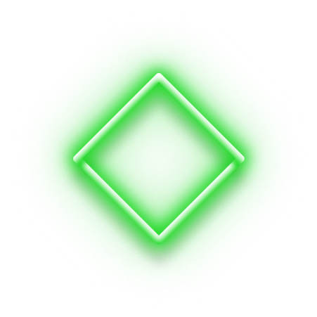
Neon elements come in three sizes. Please do not recolor them
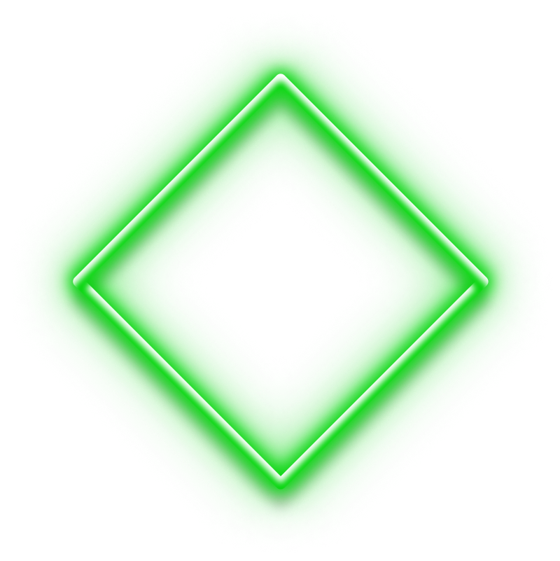
Sizes
Neon elements come in three sizes. Please do not resize them.
Large
112px 3pt
Medium
72px 2.5pt
Small
48px 2pt
Available Shapes
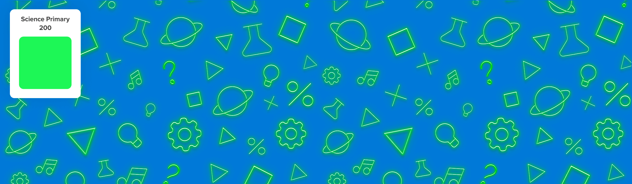
Neon Patterns
We have patterns made of the neon elements available—use them in a variety of creative ways. You are welcome to change out the backgrounds, but do get in touch with a Visual Designer if you need assistance.
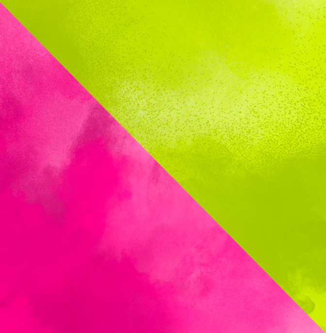
Gradient Backgrounds
We paint gradient backgrounds in Procreate using cloud brushes. There are three for each subject matter and then several for the Platform and main DE brand colors. You can use them as background fills or crop them into shapes. Try new ways to use them and share with the rest of us to keep things fun!
If you have a need for additional gradient backgrounds, just ask the Visual Design Team.
Click on any swatch below to enlarge.
Science Gradient 1
Science Gradient 2
Science Gradient 3
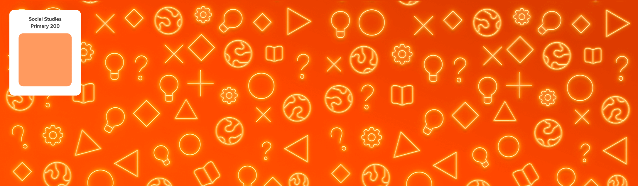
Social Studies Gradient 1
Science Gradient 2
Science Gradient 3
STEM Gradient 1
STEM Gradient 2
STEM Gradient 3
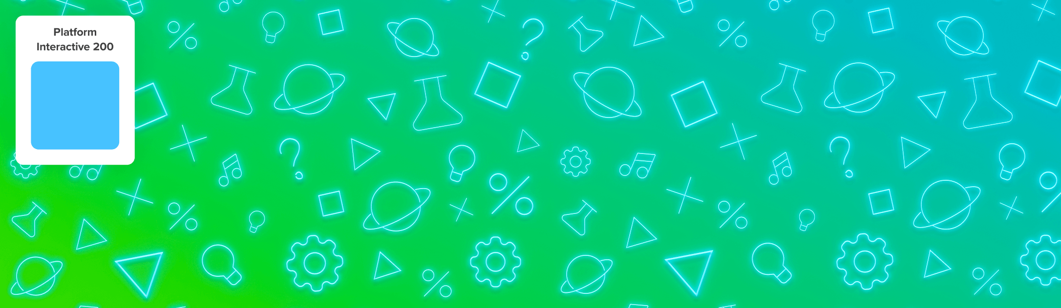
Platform Interface Gradient
Platform Interactive Gradient
White Gradient
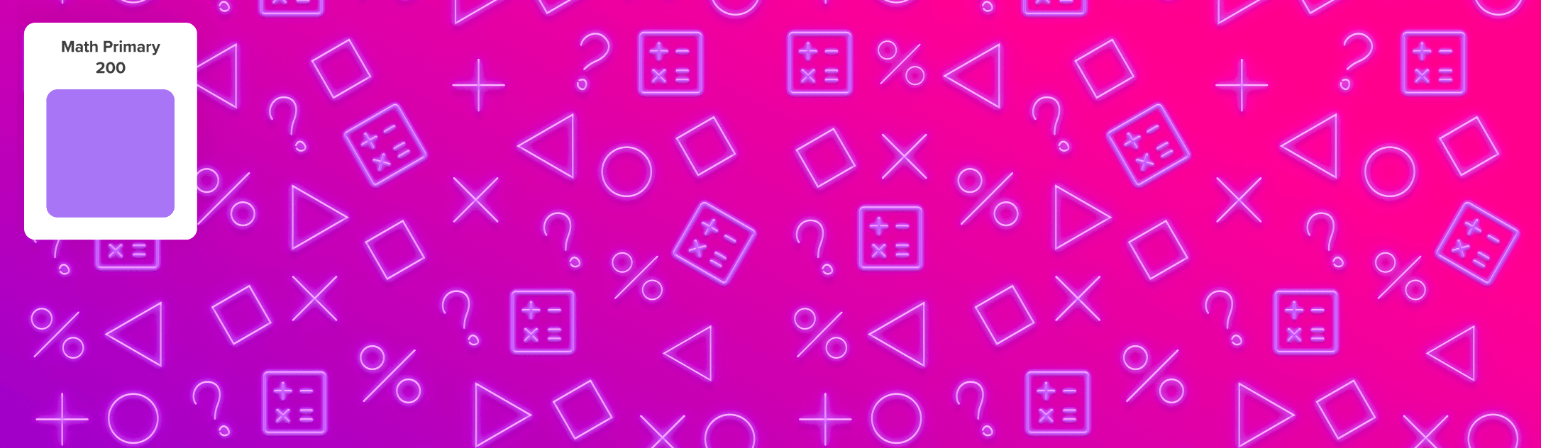
Math Gradient 1
Platform Interface Gradient
Math Gradient 3
Teach Gradient 1
Teach Gradient 2
Teach Gradient 3
Health Gradient 3
Health Gradient 2
Health Gradient 1
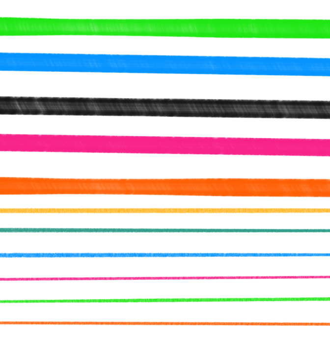
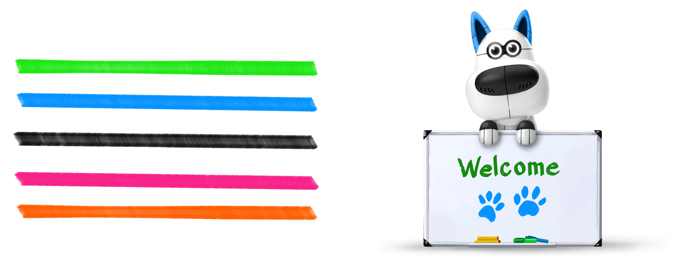
Pens and Pencils
At DE, we use several different pens and pencils in Procreate to create our brand vibe when we design and illustrate. Here are some of the most popular ones that you will recognize from our products.
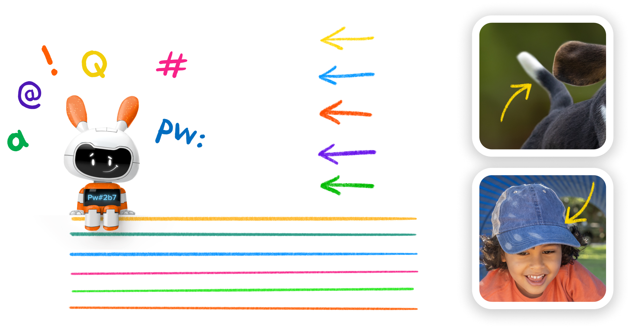
Expo Markers
Because these are common tools used by teachers, and we aim for authenticity in all our graphic design, we never use a real font or a pen that would not naturally be used on a whiteboard.
Pencils
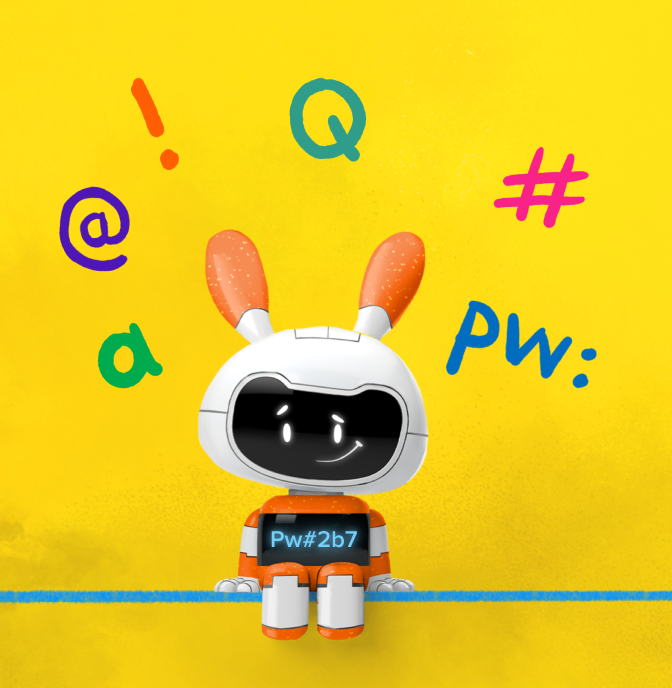
We use a number of Procreate pencils and brushes to achieve a hand-drawn feel in the illustrations that surround our page elements, such as arrows and small illustrations. We strive to be consistent, and Procreate’s Gloaming helps us to be so.
Nikko Rull
Nikko Rull is a free rull brush from Procreate made to imitate the look of a paint roller. It’s great for finishing off the edges of a scene. We also use it for backgrounds that we want to end in a looser style rather than a traditional frame.
How To
Below are examples of how to combine the brand’s graphic elements of backgrounds, neons, and illustration styles along with rules on what to avoid so that every design you do reflects the visual identity of Discovery Education.
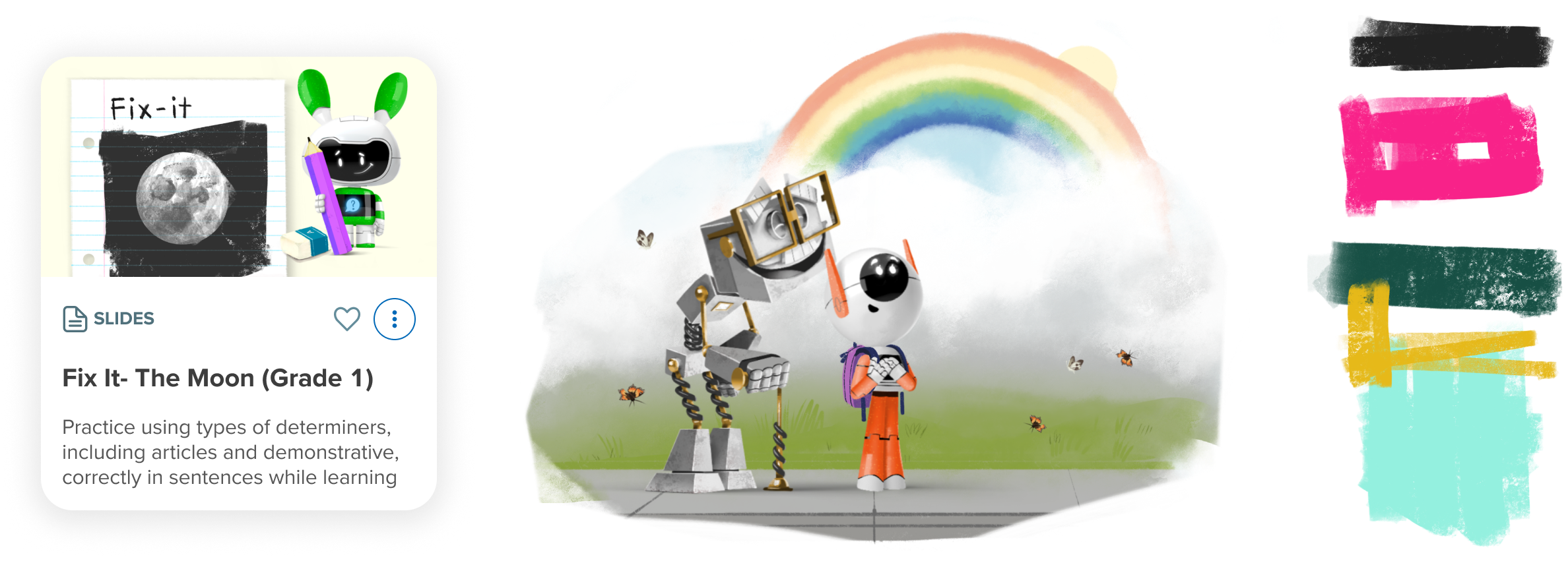
Banner Example
These are banners designed for the home page of the platform. They represent in-product marketing within the platform where the content is housed, not the content itself. The examples illustrate a nice balance of possible styles that combine our brand elements of characters, neon glyphs, and one or two backgrounds.
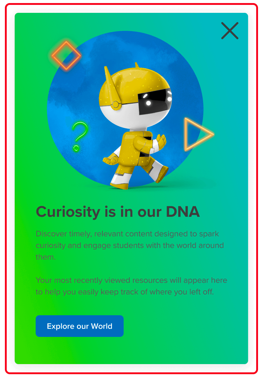
Option 1
Neon Elements come from the Nebula Figma library and conform to our S, M, and L sizes.
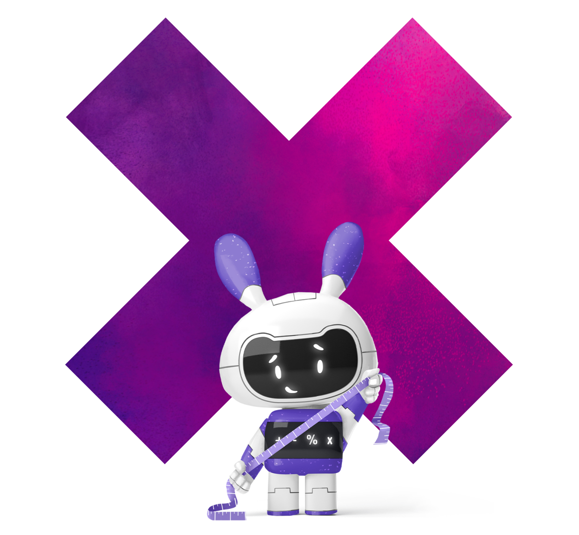
DE Character is chosen with a consult from the Characters team.
Gradient Background is contained within a background shape. This is the proper use of these textured backgrounds, so they don’t visually take over the page and distract from the messaging/content. Unless you are working editorially, do not use a full width textured background in your layout.
Typography colors follow Nebula color rules and are easily readable on a white background – that’s Platform Neutral 900 for the heading and Platform Neutral 800 for the body copy.
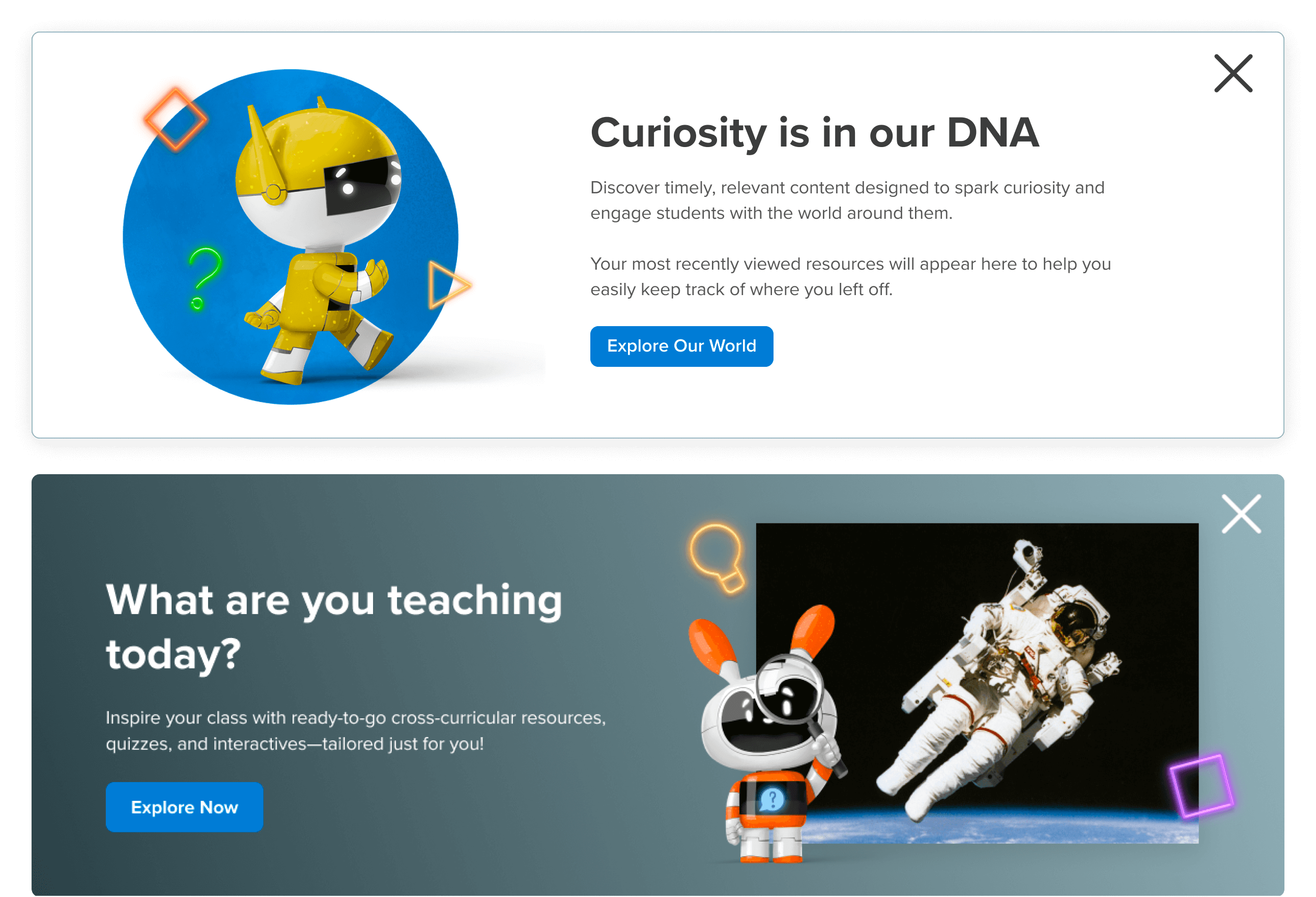
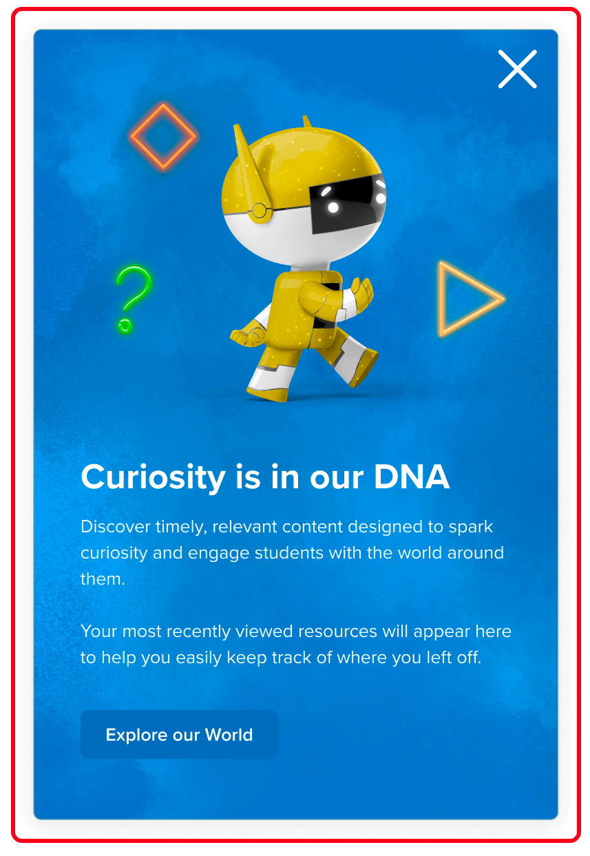
Option 2
Neon Elements come from the Nebula Figma library and conform to our S, M, and L sizes.
DE Character is chosen with a consult from the Characters team and paired with appropriate compelling photography.
Gradient Background can be created using any combination of our colors to match the material being promoted. Note- this is not one of the painted gradients.
Typography has been checked to follow the WCAG standards to AA. White is used in this case.
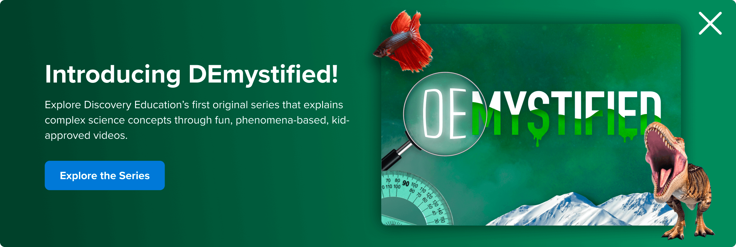
Of course, there will be many design cases that do not contain graphic branded elements. Above is a good example promoting DEMystified, a DE Original video series that uses the elements and colors specific to that series.
Painted Gradient Usage
DO: Create a pleasing vignette with the Character and graphic elements that lives separately from the copy.
DON’T: Use the painted gradient backgrounds to fill an entire banner. The type will not pass WCAG AA standards for readability and the messaging will not stand out enough as important to read.
DON’T: Use the painted gradient backgrounds to fill an entire banner. The type will not pass WCAG AA standards for readability and the messaging will not stand out enough as important to read.
DO: Work with a designer to create hand written typography within illustrations. This keeps the entire scene realistic – as if a teacher wrote the messaging.
DON’T: Use a font within illustrations. This looks jarring and breaks the illusion of storytelling we work hard to achieve.