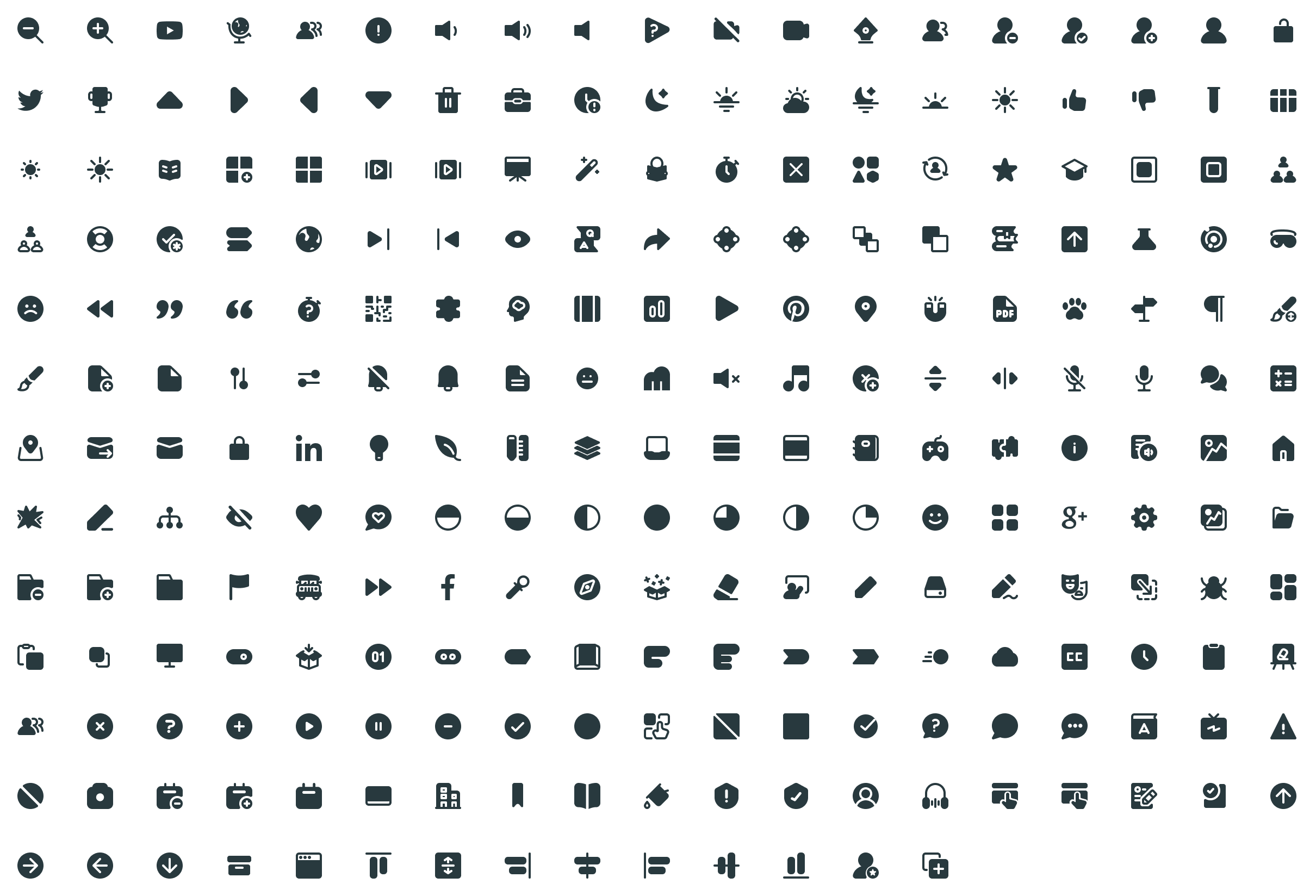
We have three levels of iconography that build in complexity to suit every application need.
Iconography is an important aspect of design that involves the use of visual symbols to communicate ideas, features, and functions to users. Icons help users easily navigate complex interfaces to understand the purpose of different elements in an array of formats. They are simple yet powerful.
Discovery Education has distinct, tailor-made sets of iconography that are an essential part of design. These help make our product and marketing more user-friendly, intuitive, and visually appealing. They are easy to understand and consistent with the overall design language and help users interact with products.
Types
User Interface iconography, Stickers, and Ideograms are all visual representations used to convey meaning and facilitate communication. However, there are some differences.
User Interface iconography is primarily used in digital interfaces to represent specific actions, objects, or concepts. Icons are designed to be easily recognizable and provide visual cues for users to interact with the interface.
Stickers are visually prominent and eye-catching, emphasizing their importance within the user interface or design composition. They’re strategically placed to draw the user’s attention to them.
Ideograms can represent a wide range of meanings and concepts, including abstract or complex ideas. They are not limited to representing specific functions or actions like UI icons.
Interface
Stroke
Filled
Sizes
Iconography currently has 4 primary sizing variants that tie to System Icons, while anything greater than 40px begins the transition to Ideograms. Ideograms are sized from 48px to 96px.
Colors
Iconography color should be approached with thoughtful consideration, as it plays a crucial role in conveying meaning and enhancing the user experience. The color selection should align with the overall design scheme and the intended emotional, informational, and interactivity context.
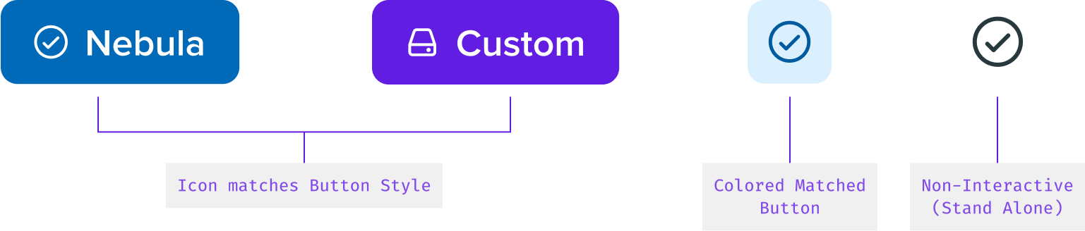
Modifiers
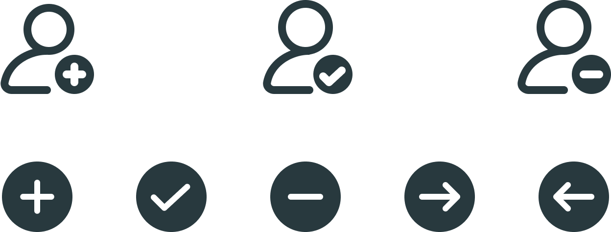
Modifiers help direct users to a specific need. This could be sending a message, deleting a message, etc. Modifiers help by serving a message of action. Generally, Modifiers can pair with icons with vector spacing in accordance with any variation of an icon.
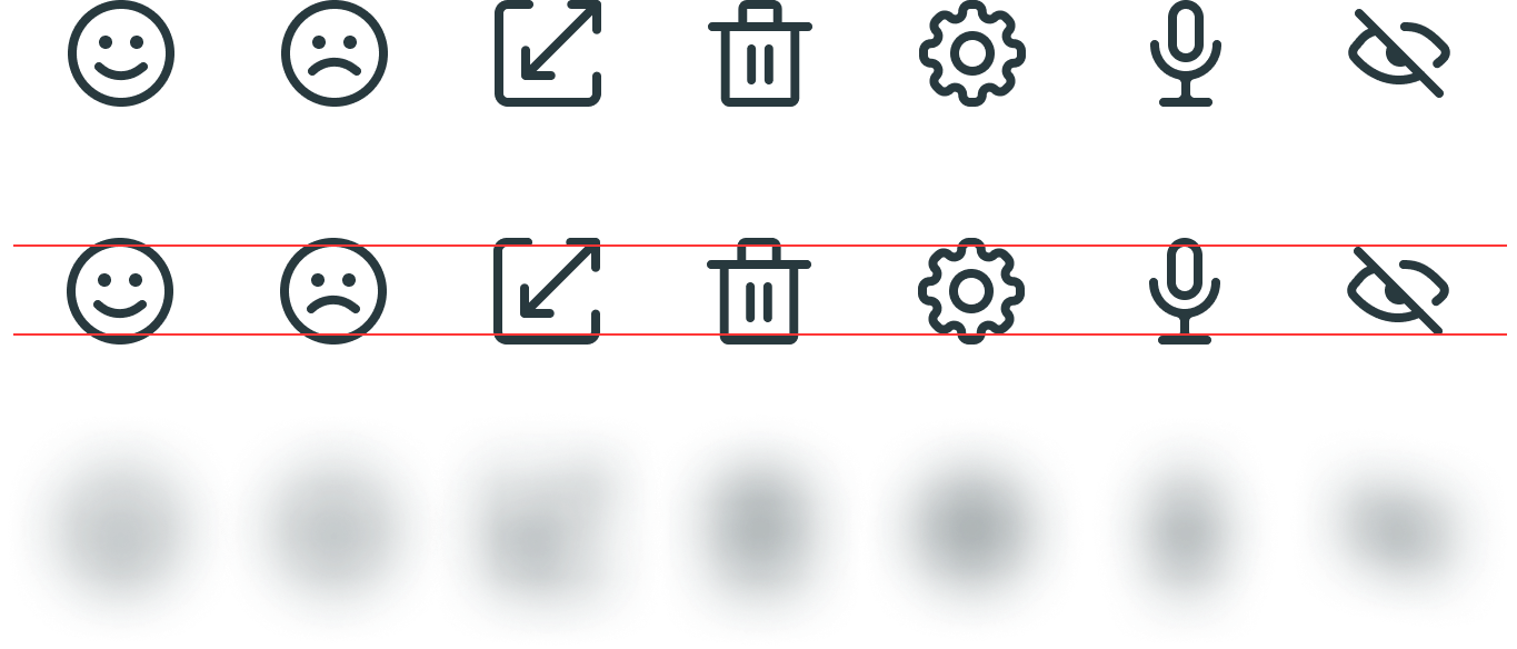
Squint Balance
Squint Balancing is a trick to make sure the overall visual weight of the iconography set is accurate and creates unity. To use this method, squint your eyes to see if the icon fits in visually with other icons, or use the Layer Blur technic to see if they match accurately.
Filled vs. Outline Usage
Solid icons are typically used when you want to draw the user’s attention or create a visual impact. They’re bold and easy to spot, which makes them great for primary actions or important navigation items.
In contrast, outline icons are more subtle and are typically used for secondary actions or informational items. They’re less visually dominant, which helps them blend into the interface and not distract from more important elements.
Choosing between solid and outline icons also depends on the overall design of your user interface. A design that is more minimalistic may prefer the use of outline icons to maintain a clean and uncluttered look, a more vibrant and dynamic interface might benefit from the use of solid icons to add to its visual appeal.
Stroke
Filled
Ideogram
An Ideogram is a graphic symbol that represents an idea or concept, rather than a particular word or sound. Ideograms are often used in writing systems that are based on logographs or pictographs, where each symbol represents a whole word or idea.
Ideograms can be very powerful communication tools because they can convey complex ideas in a simple and visually appealing way. They can be used to represent anything from objects and abstract concepts, to emotions and action
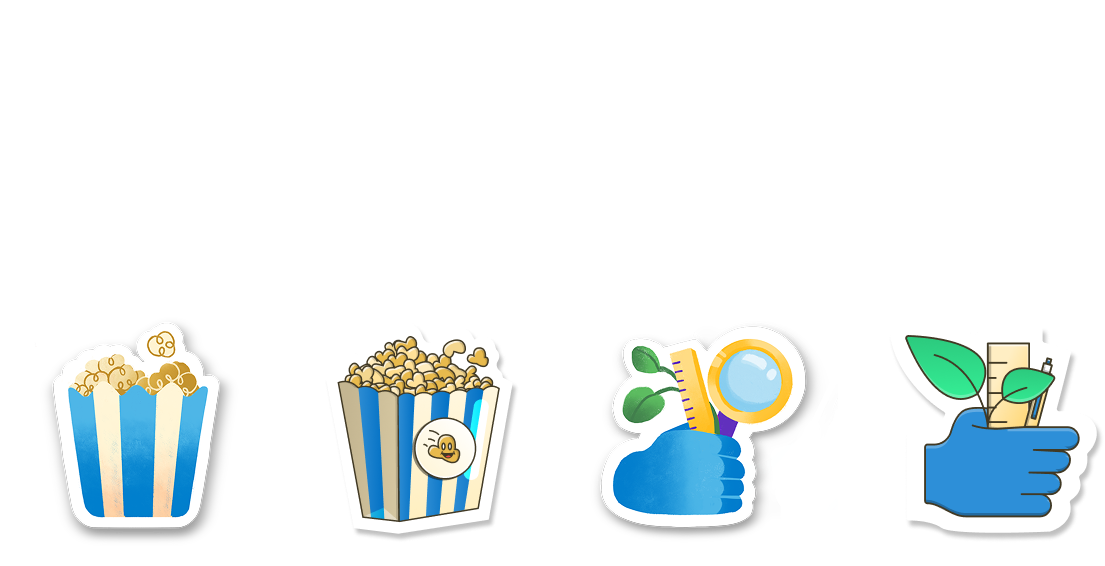
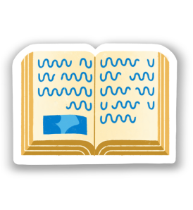
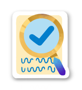
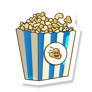
K-2 Style
The ideogram style for K-2 is “hand-painted” and it is raster. This is to create a childish friendly look and feel.
3-5 Style
The ideogram style for 3-5 is a bit more 3d and it is vector. This is to create a little more mature but still kid-friendly look and feel.
Ideogram Differences
These visual differences are purposeful to tailor our experiences between the two individual grade bands with playfulness and maturity. The two sets below are in the Earth Science color palette- they come in a variety of other color palettes.
Grades K-2
The style for K-2 is raster with a soft hand-drawn feel
Video
Interactive
Read Together
Reading Passage
Claim Evidence Reasoning
Hands-On Activity
Real World Phenomenon
Evaluate
Grades K-2
The style for K-2 is raster with a soft hand-drawn feel
Video
Interactive
Read Together
Reading Passage
Claim Evidence Reasoning
Hands-On Activity
Real World Phenomenon
Evaluate
Examples of Iconography Usage in Product
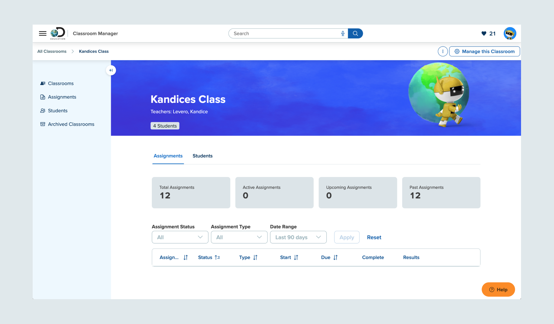
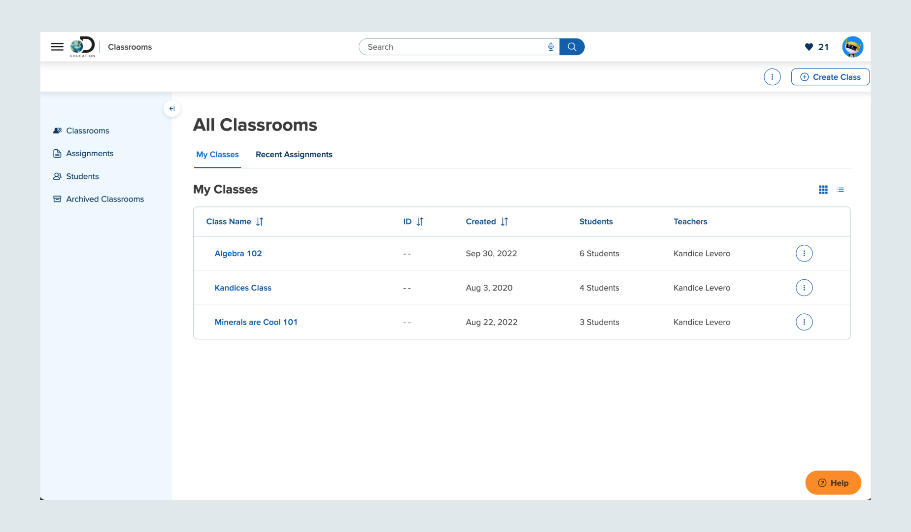
The Classroom view uses many User Interface level icons to organize information and make it scannable and easy to use. You can see UI icons on the left-hand panel, the Manage Classrooms button and the top right “likes.”
Additional UI icons in the Classrooms page include a toggle to choose a view of information and the often-used ellipses in circle to indicate expanded information available.
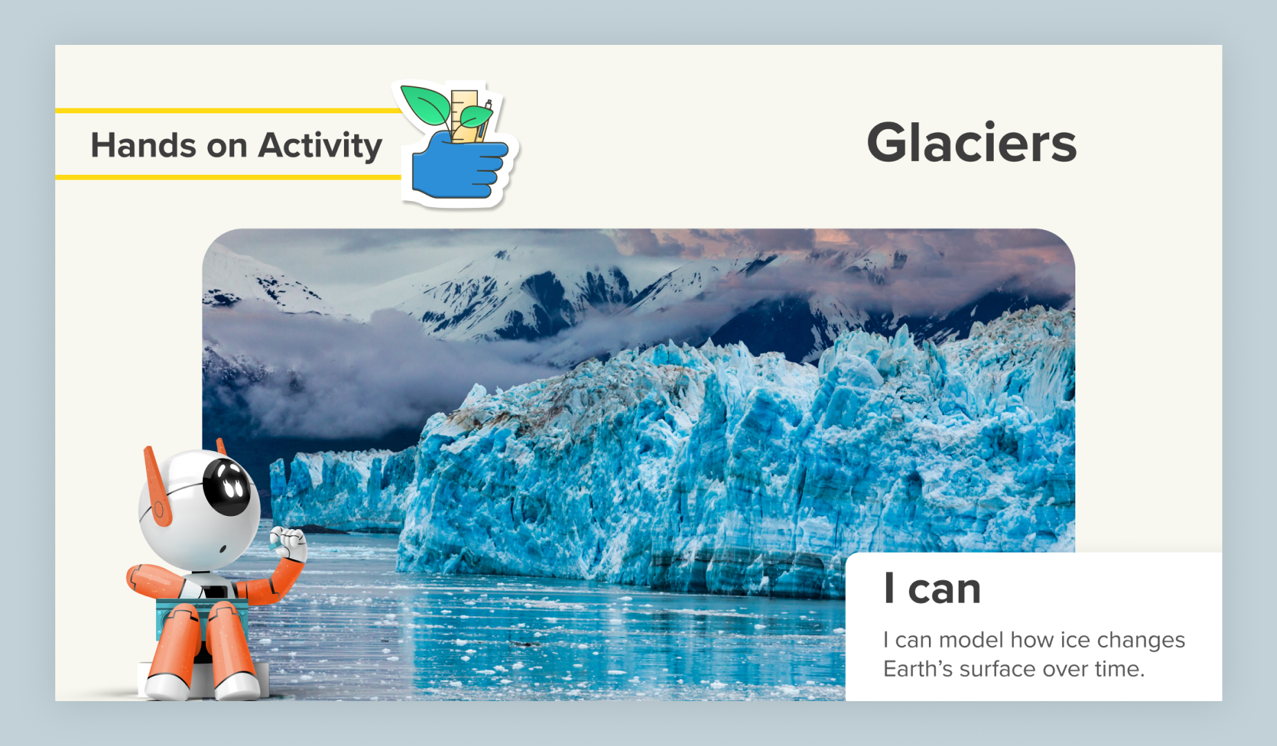
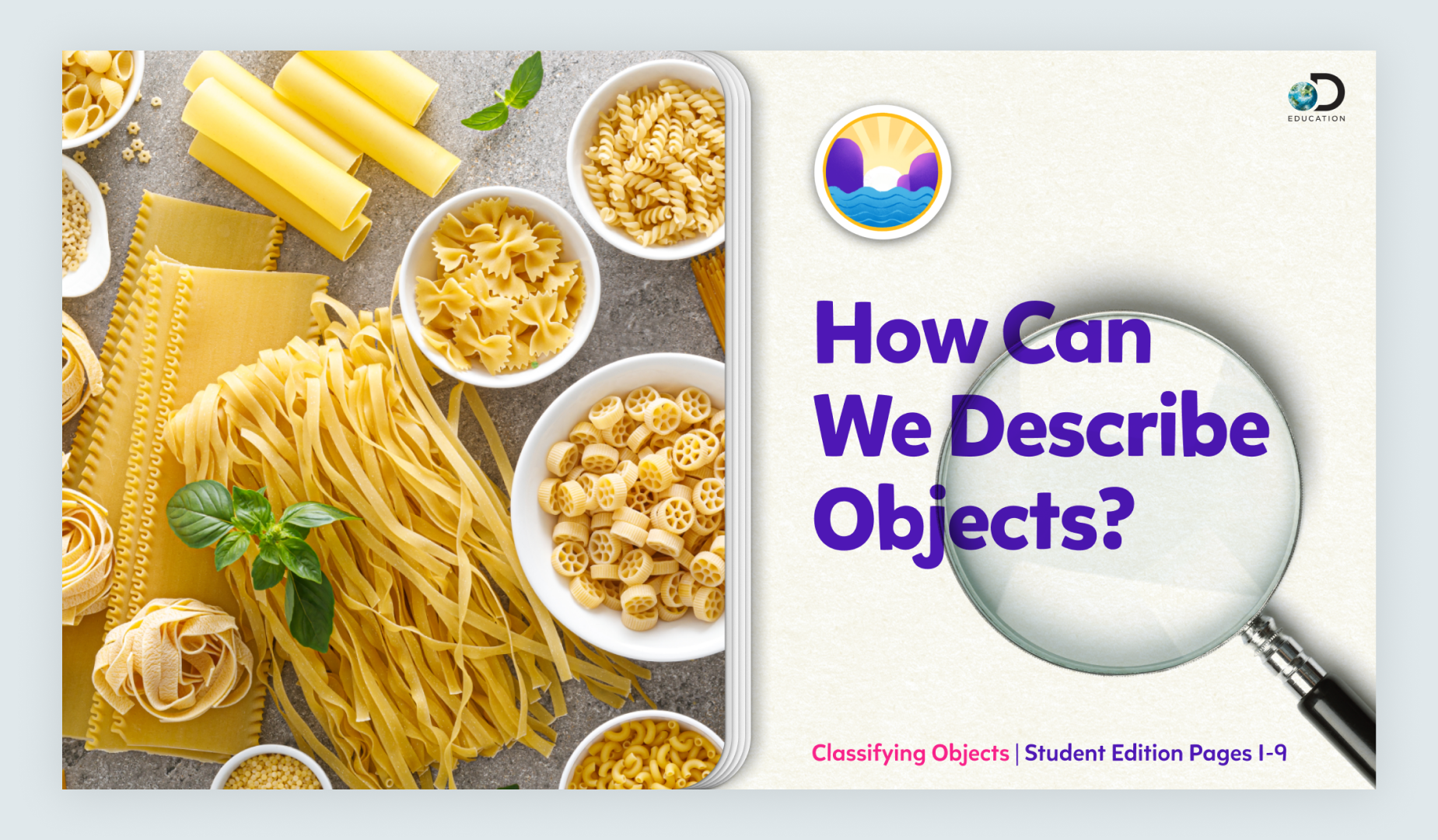
This lesson slide uses the 3-5 Hands-On Activity ideogram to indicate the lesson type. *Note- color palette is specific to Science Techbook.
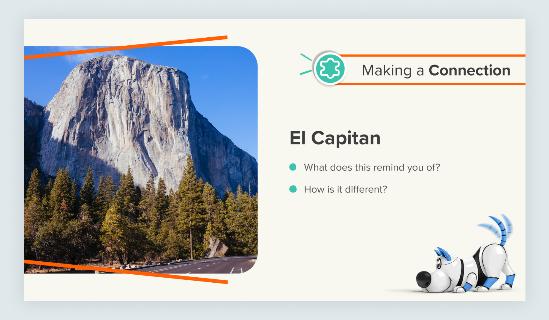
This lesson slide uses the Connection Sticker Icon to indicate the activity type. *Note- color palette is specific to Science Techbook.
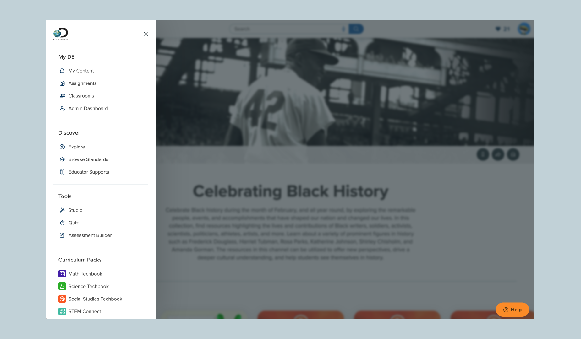
The navigation menu uses many IU icons in various states to organize key products and services we offer at Discover Education.
This lesson title slide uses the K-2 Real-World Phenomenon ideogram to indicate the lesson type. *Note- color palette is specific to Science Techbook.