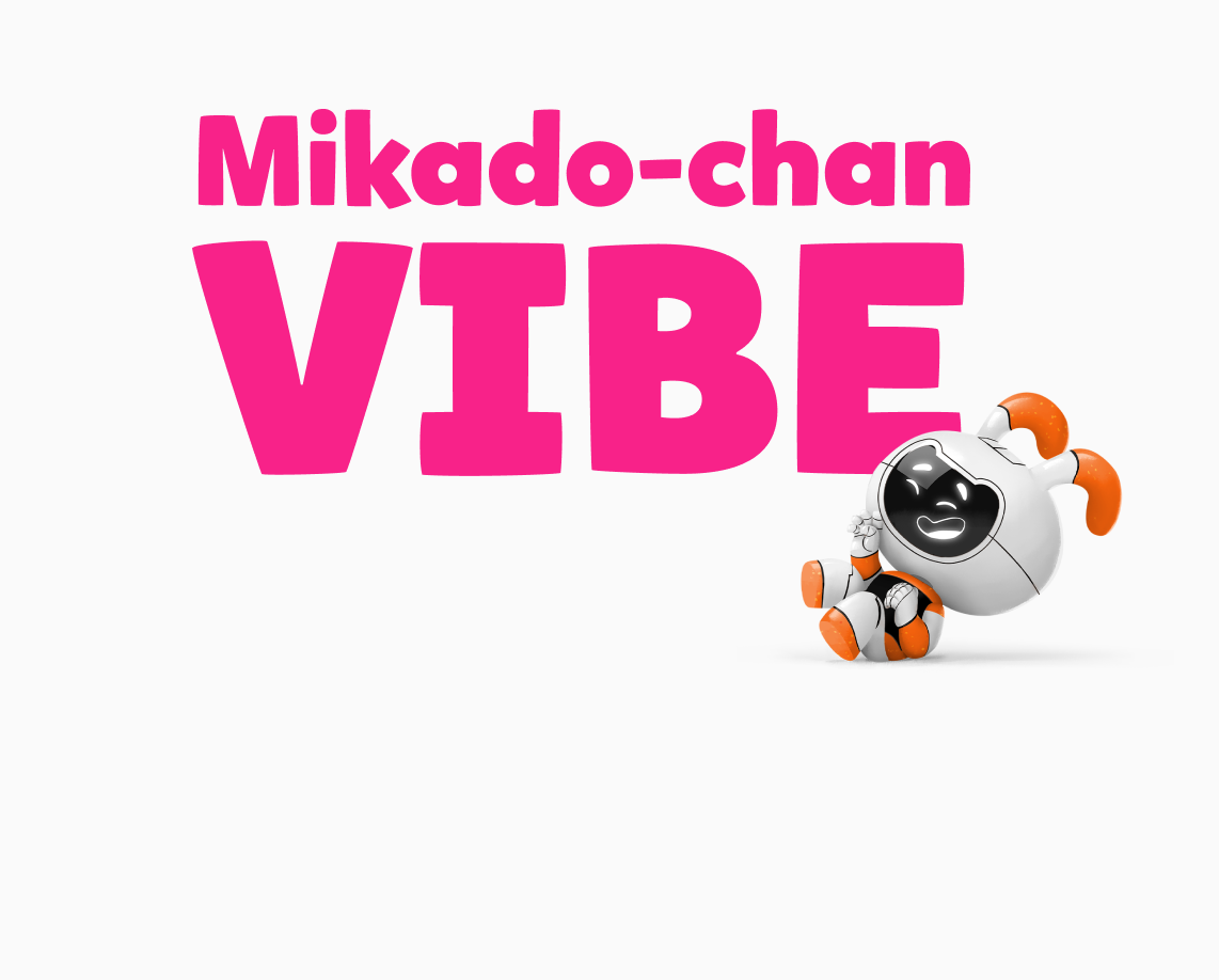
Mikado-chan is a customized font that was designed with the way young learners are taught to read and write in mind. Discovery Education owns the exclusive rights to Mikado-chan, which is a variation of the existing font, Mikado.
Mikado (帝): King or Emperor Mikado-chan (帝ちゃん): Little King or Child King Designer: Hannes von Döhren, in collaboration with our Sr. Designers Joyce Tai-Chau and Alexandra Corona
Aa Bb Cc Dd Ee Ff Gg Hh Ii Jj Kk Ll Mm Nn Oo Pp Qq Rr Ss Tt Uu Vv Ww Xx Yy Zz 1234567890!
Mikado-Chan Available Weights
Mikado-chan is available in six weights: Light, Regular, Medium, Bold, Black, and Ultra.
We use Regular for paragraph copy within lessons and Bold for headers. Light, Black, and Ultra should only be used for editorial design products such as informative web pages, packaging, and marketing design.
Mikado-Chan Light
Mikado-Chan Regular
Mikado-Chan Medium
Mikado-Chan Bold
Mikado-Chan Black
Mikado-Chan Ultra
Mikado-Chan Recommended Styles
Mikado-chan is primarily used in student content for Grades PreK–2. There is a limited range of recommended sizes available because the text needs to be large and readable.
Jumbo
Size: 140px Line Height: 115% Weight: Black (900)
Title
Size: 80px Line Height: 120% Weight: Bold (700)
Header
Size: 70px Line Height: 120% Weight: Bold (700)
Body Copy
Size: 40px Line Height: 135% Weight: Regular (400)
Caption
Size: 25px Line Height: 120% Weight: Regular (500)
Mikado-Chan Examples in Lessons
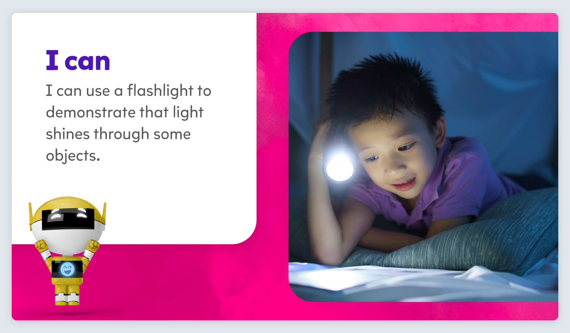
We always use Mikado-chan in Grade K lessons. It is the only font that meets the needs of early learners for reading and learning to write.
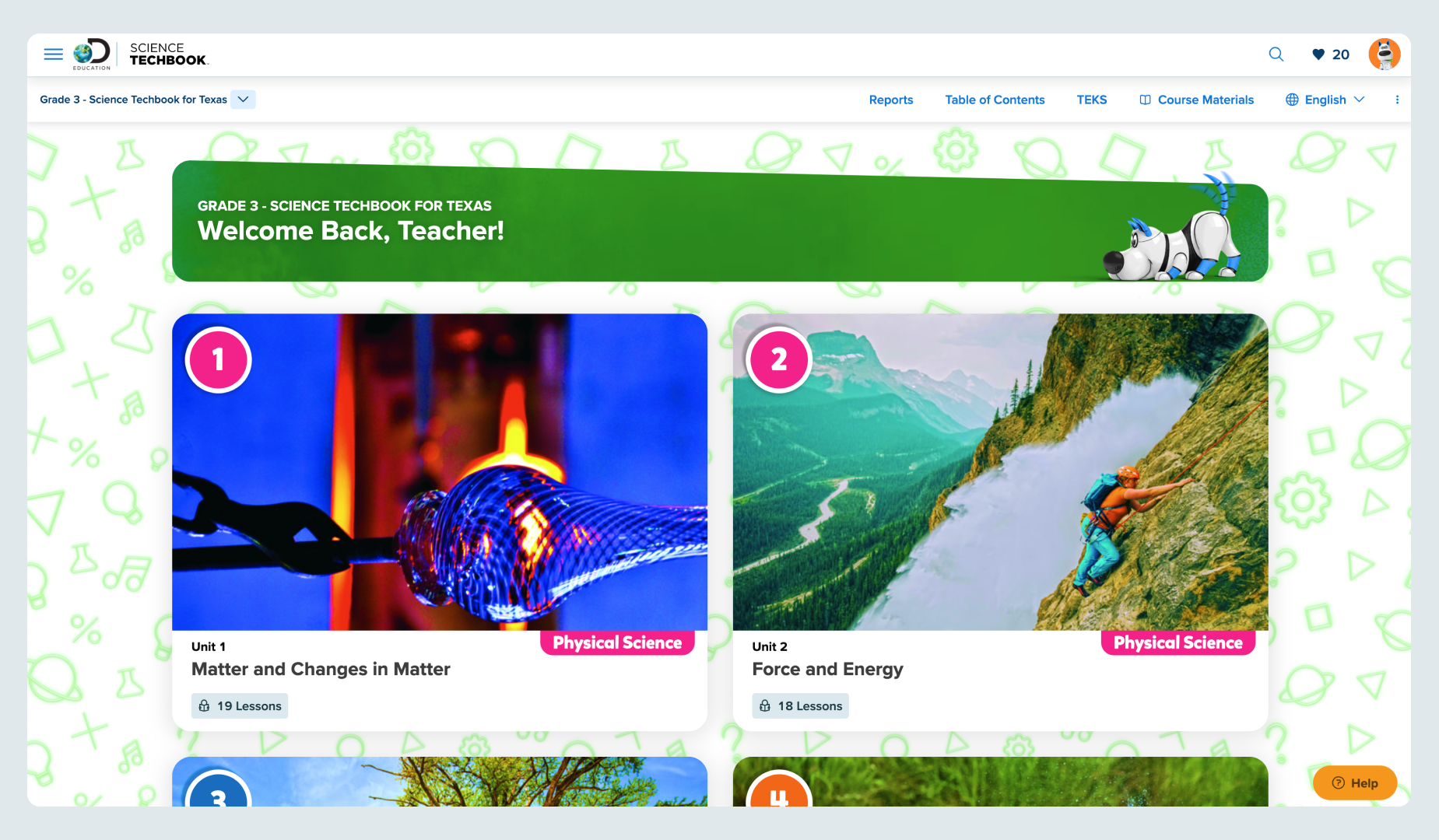
Mikado-chan is used here as an accent font on a teacher’s dashboard in Science Techbook. For teacher-facing products, we can use both Mikado-chan and Proxima Vara.
We always use Mikado-chan in Grade K lessons. It is the only font that meets the needs of early learners for reading and learning to write.
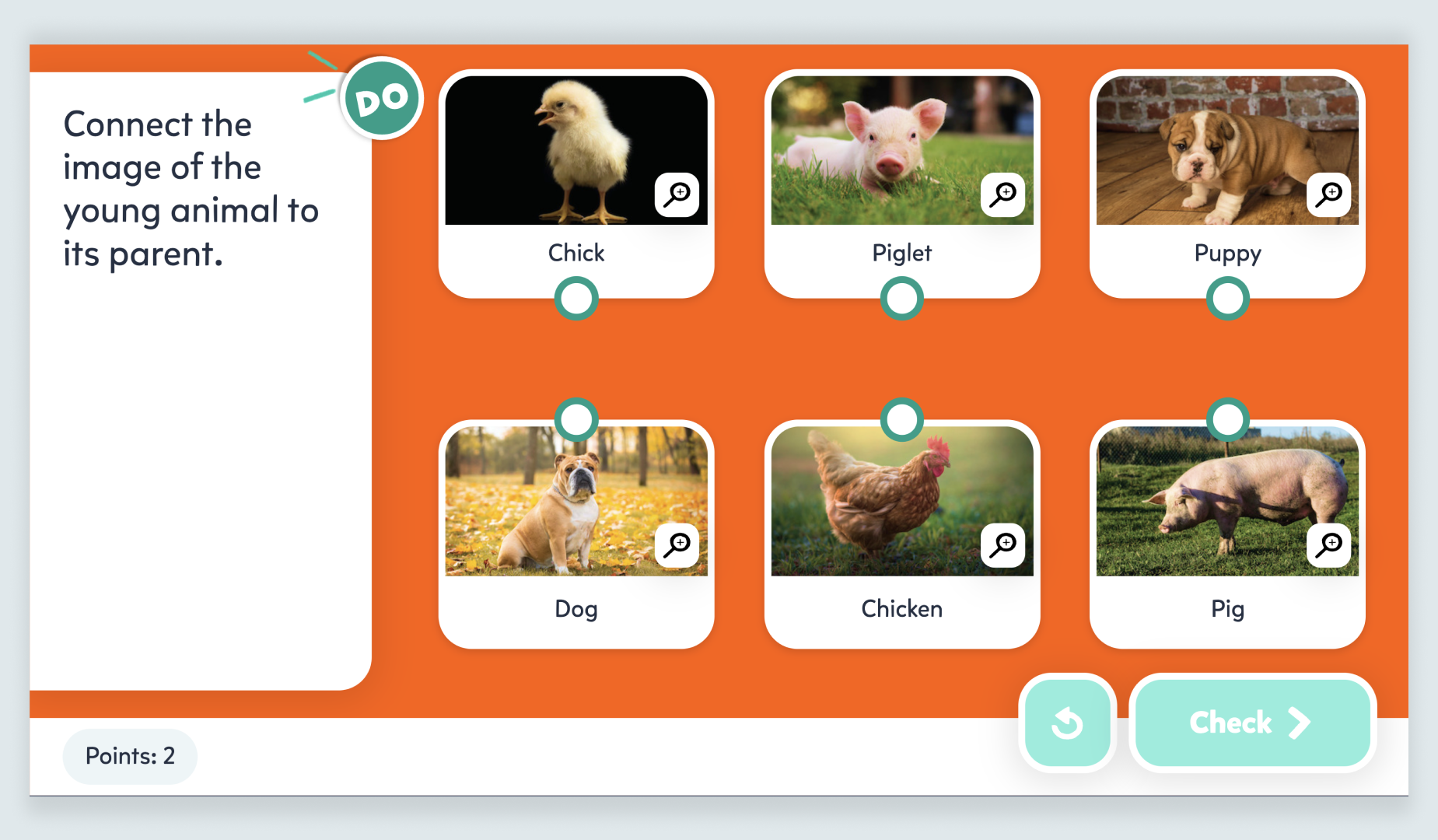
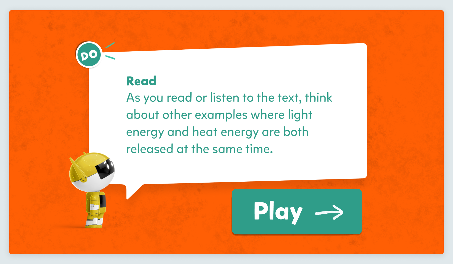
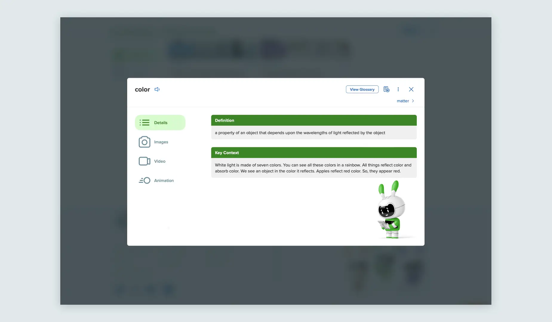
On this K–5 check for understanding slide, we use Mikado-chan. It is the only font that meets the needs of early learners for reading and learning to write.
We always use Mikado-chan in Grade 2 lessons. It is the only font that meets the needs of early learners for reading and learning to write.
We always use Mikado-chan in Grade K lessons. It is the only font that meets the needs of early learners for reading and learning to write.
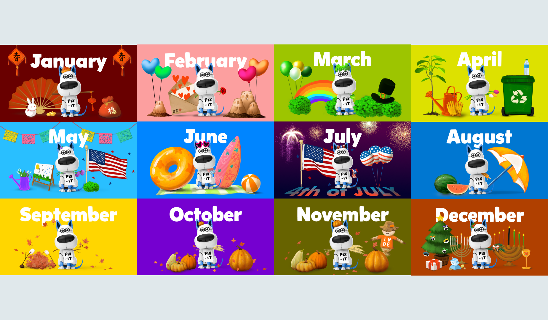
We create unique art for every holiday in our popular monthly Sentence Fix-it activity. Mikado-chan is a fun font to use in these cases.
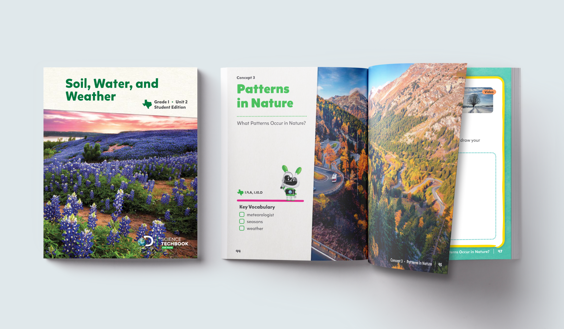
We always use Mikado-chan in Grade 1 textbooks. It is the only font that meets the needs of early learners for reading and learning to write.
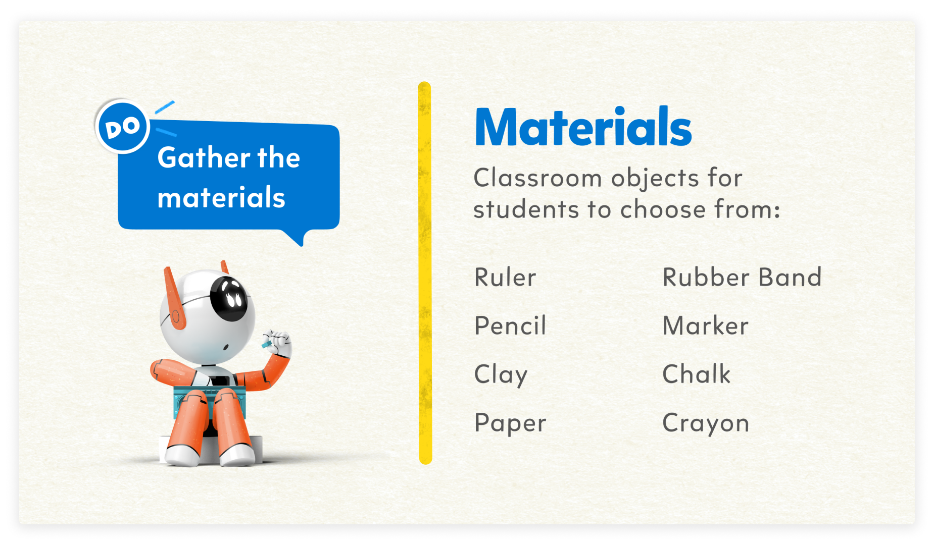
We always use Mikado-chan in Grade K lesson material lists. It is the only font that meets the needs of early learners for reading and learning to write.
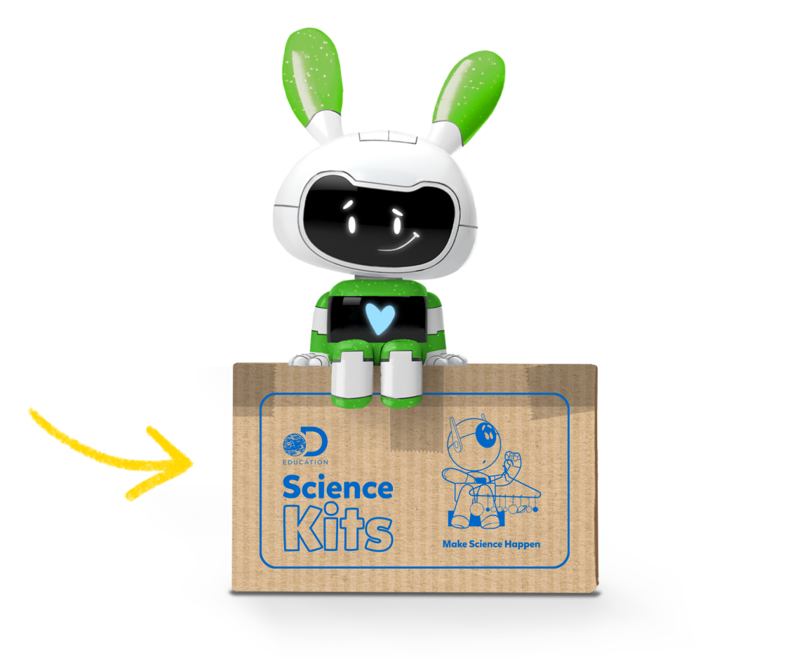
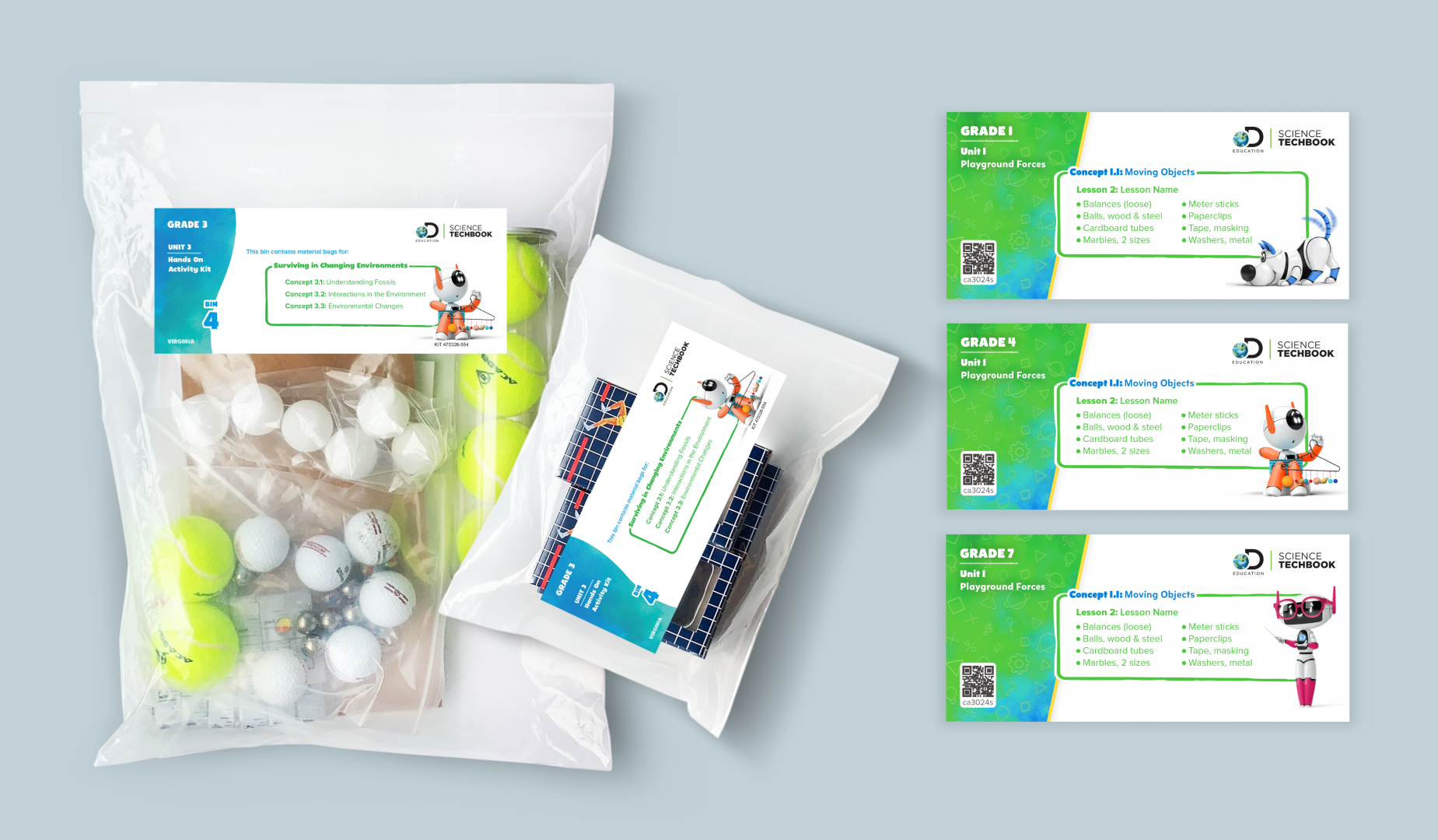
Mikado-chan is used here as an accent font for the DE Science Kit packaging. Because the packaging itself is teacher-facing, it’s fine to mix Mikado-chan and Proxima Vara.
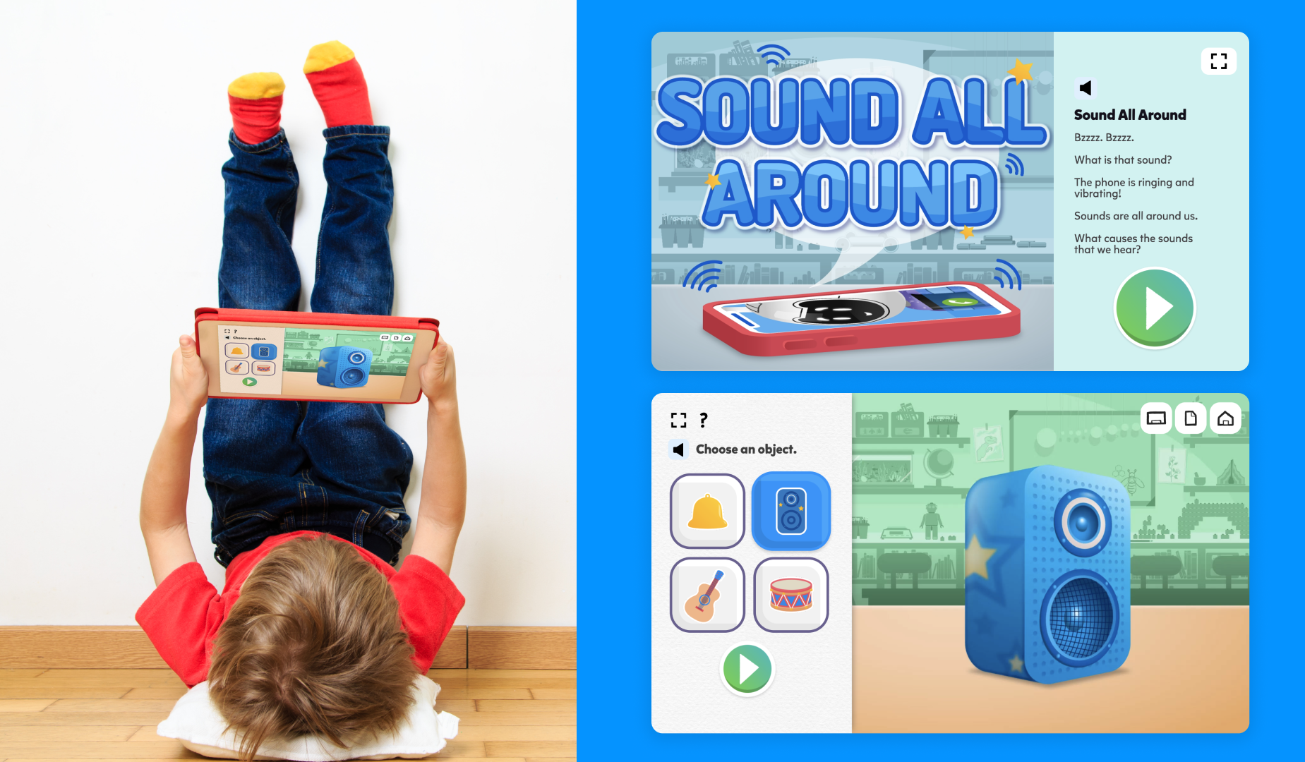
Sound All Around is a popular interactive learning game which utilizes Mikado-chan for Grades K–2.
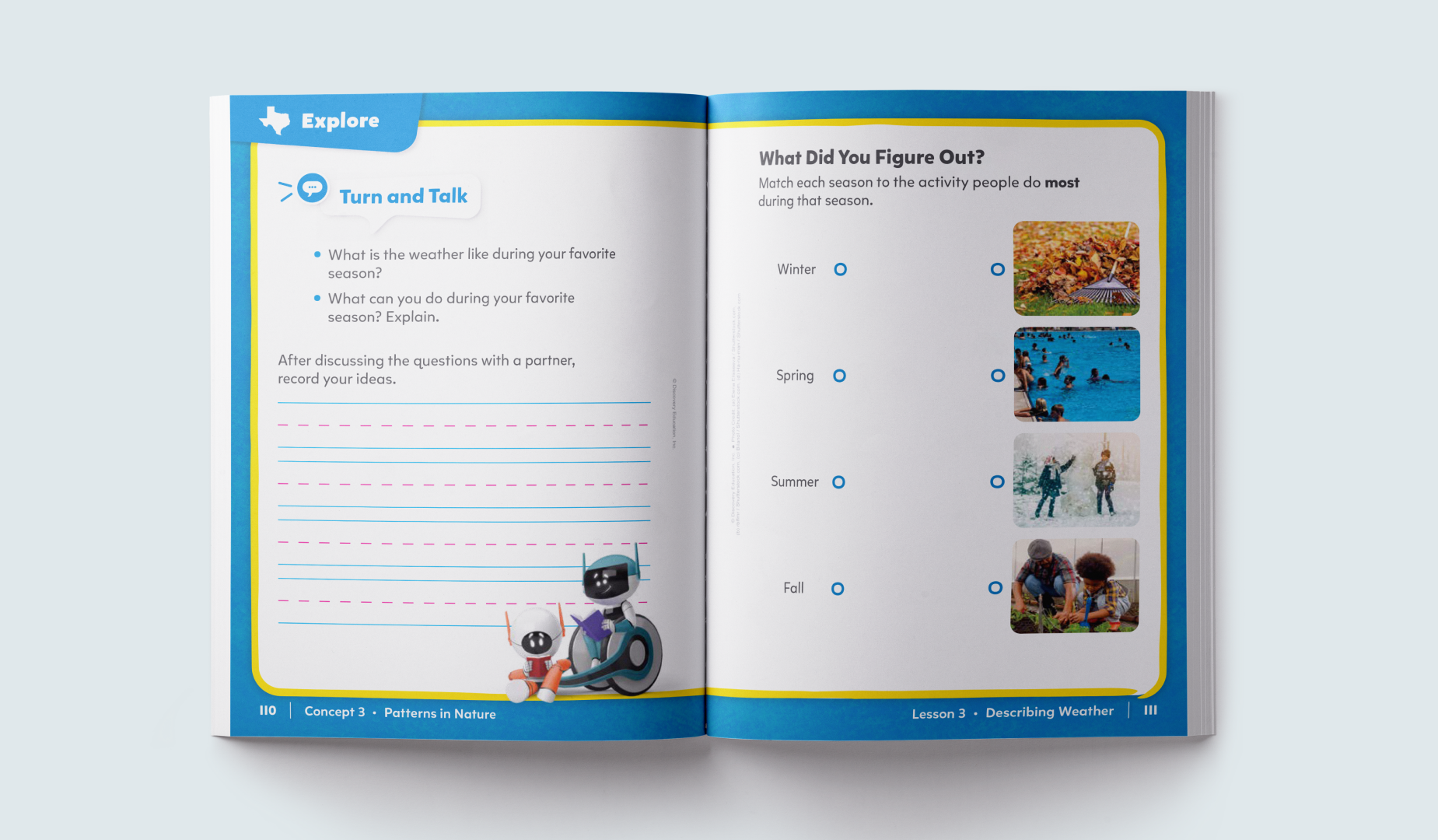
Mikado-chan is used for all Grade 1 workbooks. It replicates the way students are taught to read and write.
Type and Color
Both Mikado-chan and Proxima Vara use Platform Neutral 800 for paragraph or body copy, but rules around headers differ.
Header: Color exploration is encouraged for grades PreK-2. It must pass passing AA accessibility standards. Paragraph Copy: Platform Neutral 800
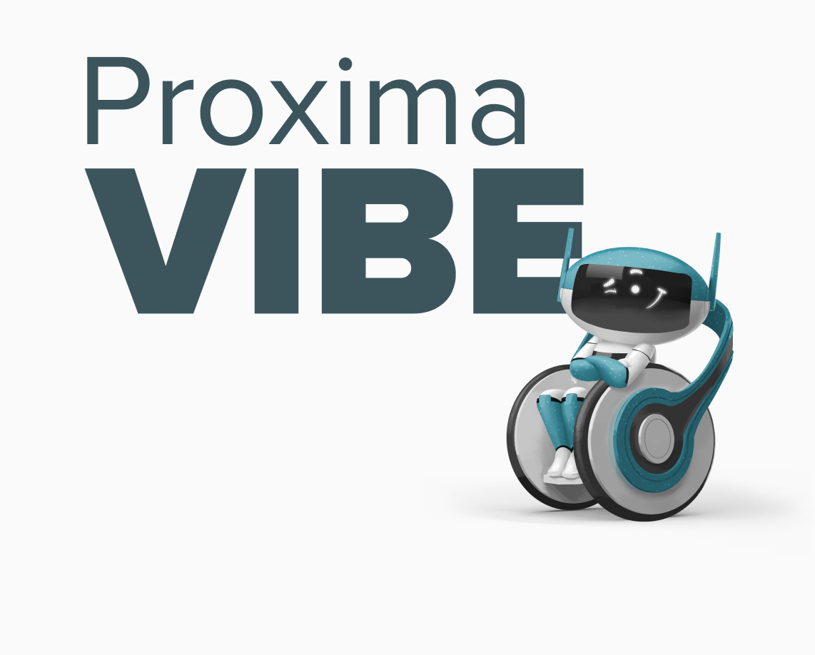
Proxima Vara is an exciting new addition to our font family. It is a versatile and flexible typeface that builds upon the success of our previous typeface, Proxima Nova. With Proxima Vara, we have expanded the range of weights, widths, and slants available to our designers. This allows for greater creativity and customization when it comes to creating effective type hierarchies for different design needs and use cases.
Proxima Vara Regular
Proxima Vara Semi-Bold
Primer Vara Bold
Aa Bb Cc Dd Ee Ff Gg Hh Ii Jj Kk Ll Mm Nn Oo Pp Qq Rr Ss Tt Uu Vv Qq Xx Yy Zz 1 2 3 4 5 6 7 8 9 0 ! @ # $ % ^ & *
Sizing
Predetermined sizes for all headings and body copy establish a clear hierarchy in our typography. This guides a user’s attention to different sections of our interface. We have also included specifications for tracking and leading to enhance readability and ensure a pleasant reading experience.
Headings
H1
68px
Regular, Bold
120% Line Height
H2
54px
Regular, Bold
120% Line Height
H3
43px Regular, Bold 120% Line Height
H4
35px Regular, Bold 120% Line Height
H5
28px Regular, Bold 120% Line Height
H6
24px Regular, Bold 120% Line Height
Body
Body 1
18px Regular, Semi-Bold, Bold 140% Line Height
Body 2
16px Regular, Semi-Bold, Bold 130% Line Height
Small Captions
14px Regular, Semi-Bold, Bold 140% Line Height
Specifications
Tracking
The tracking throughout the use of Proxima Vara is set to 0 (default) and remains unaltered when being used.
Leading
Leading (line height) when using Headlines stays fluent at 120% throughout, while our Body type(s) various between 130% to 140% when being used.
Usage
Below, find the specifics of how we set up interface core components to work seamlessly with our Proxima Vara typeface. Through careful alignment and integration of design principles, Proxima Vara ensures a visually appealing user experience.
Examples of Proxima Vara in Product
We use Proxima Vara across different components to deliver clear and succinct information. This helps to create organized user interfaces, ensuring consistent navigation patterns.
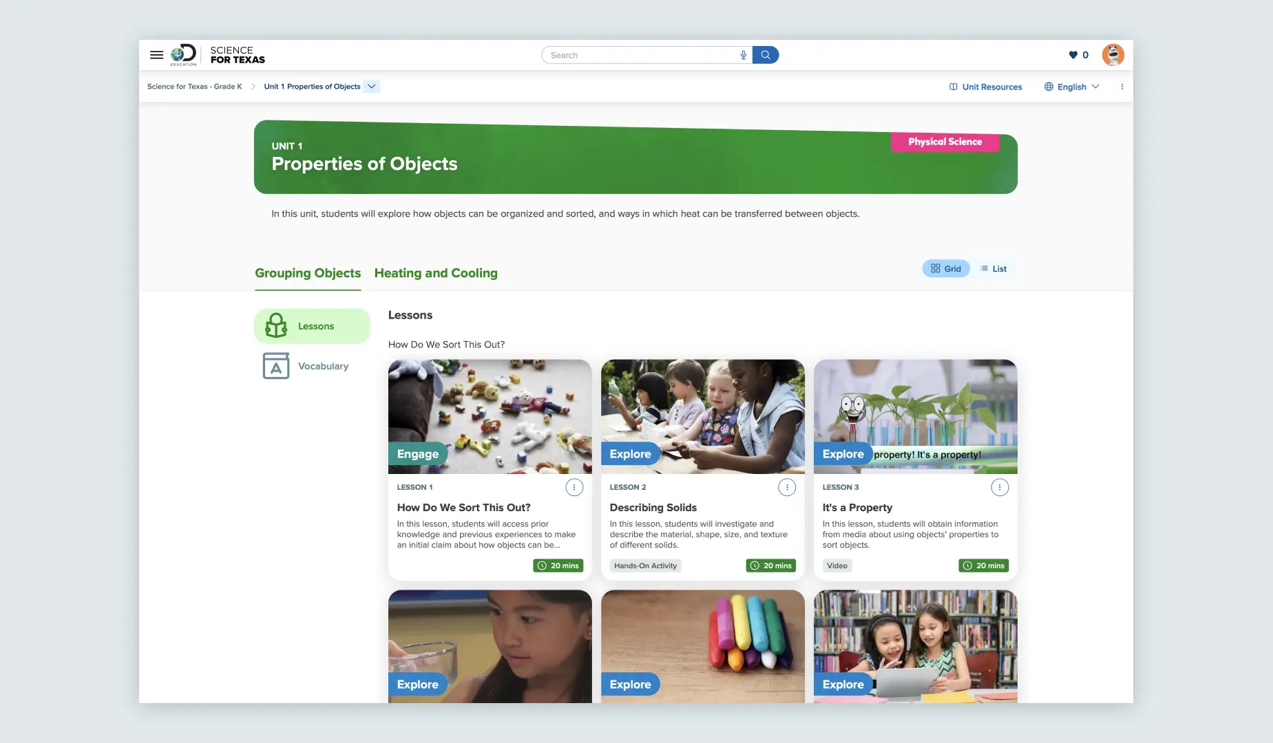
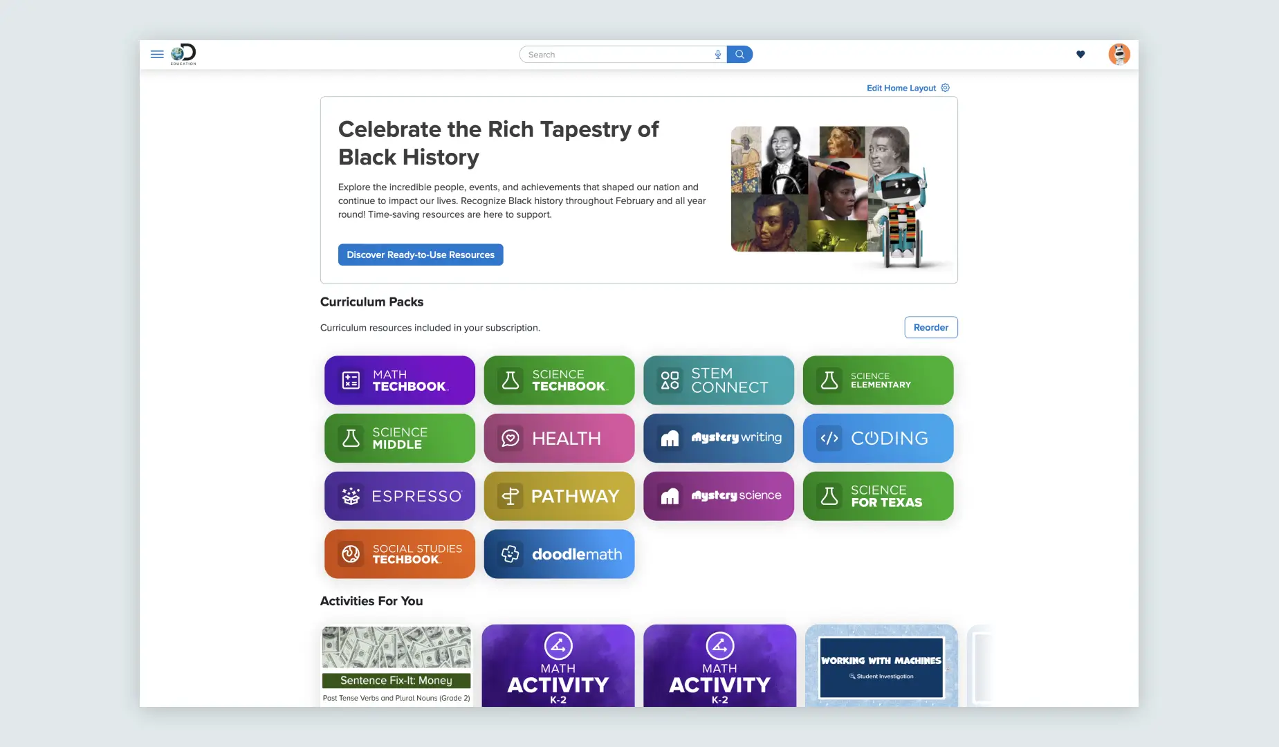
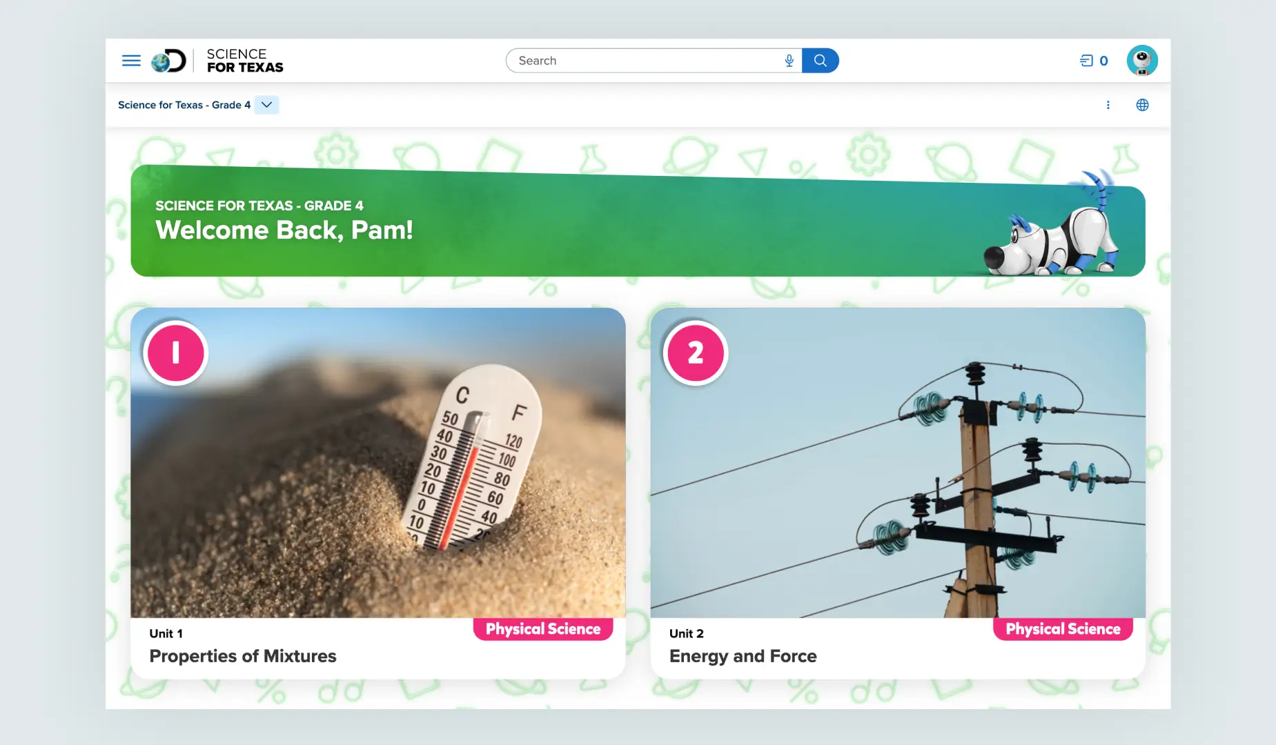
Our homepage incorporates the Proxima Vara font across various interface elements such as cards, banners, and titles.
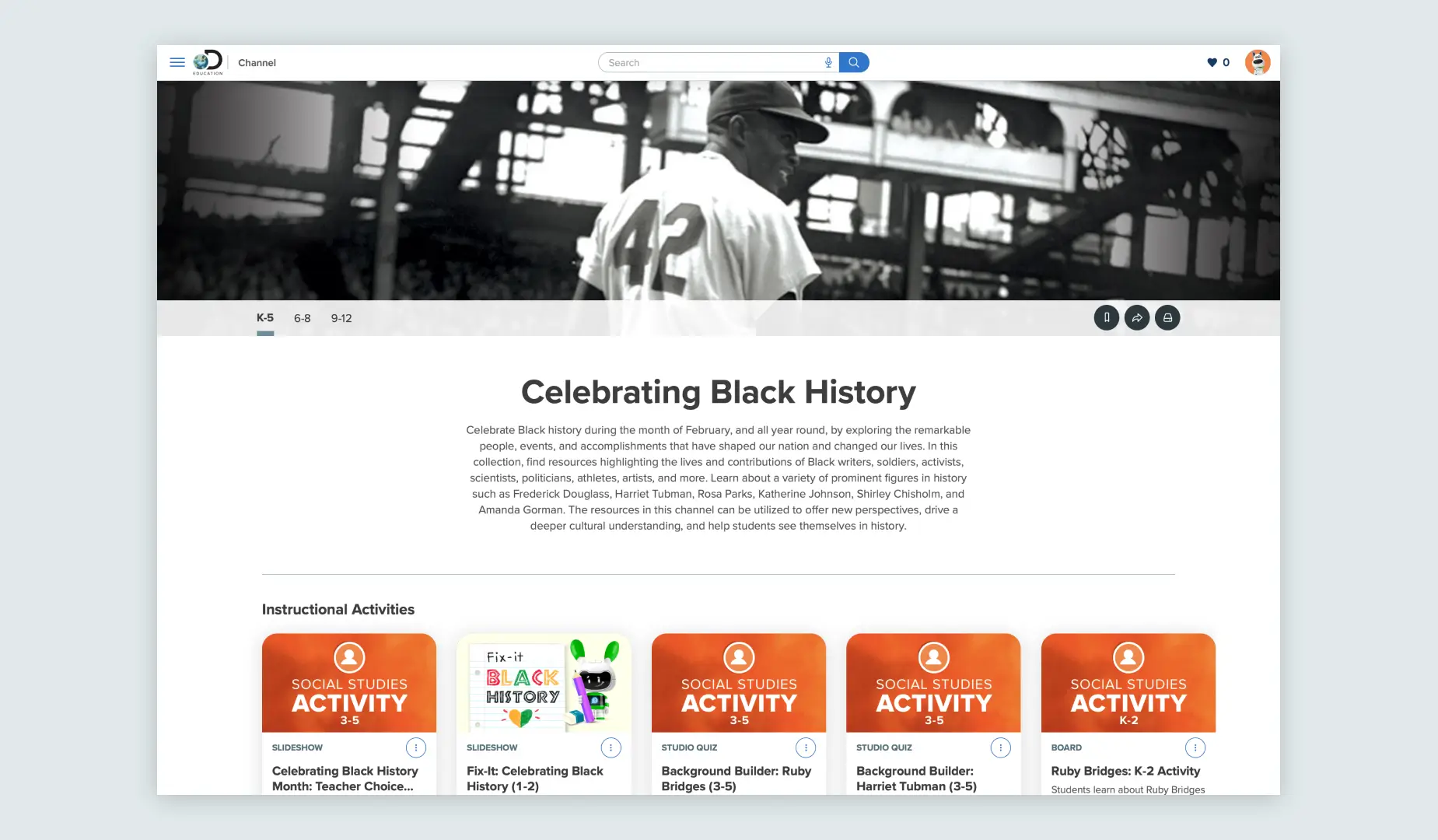
We use Proxima Vara for displaying titles and details for Channels, along with sections of the channel and associated assets.
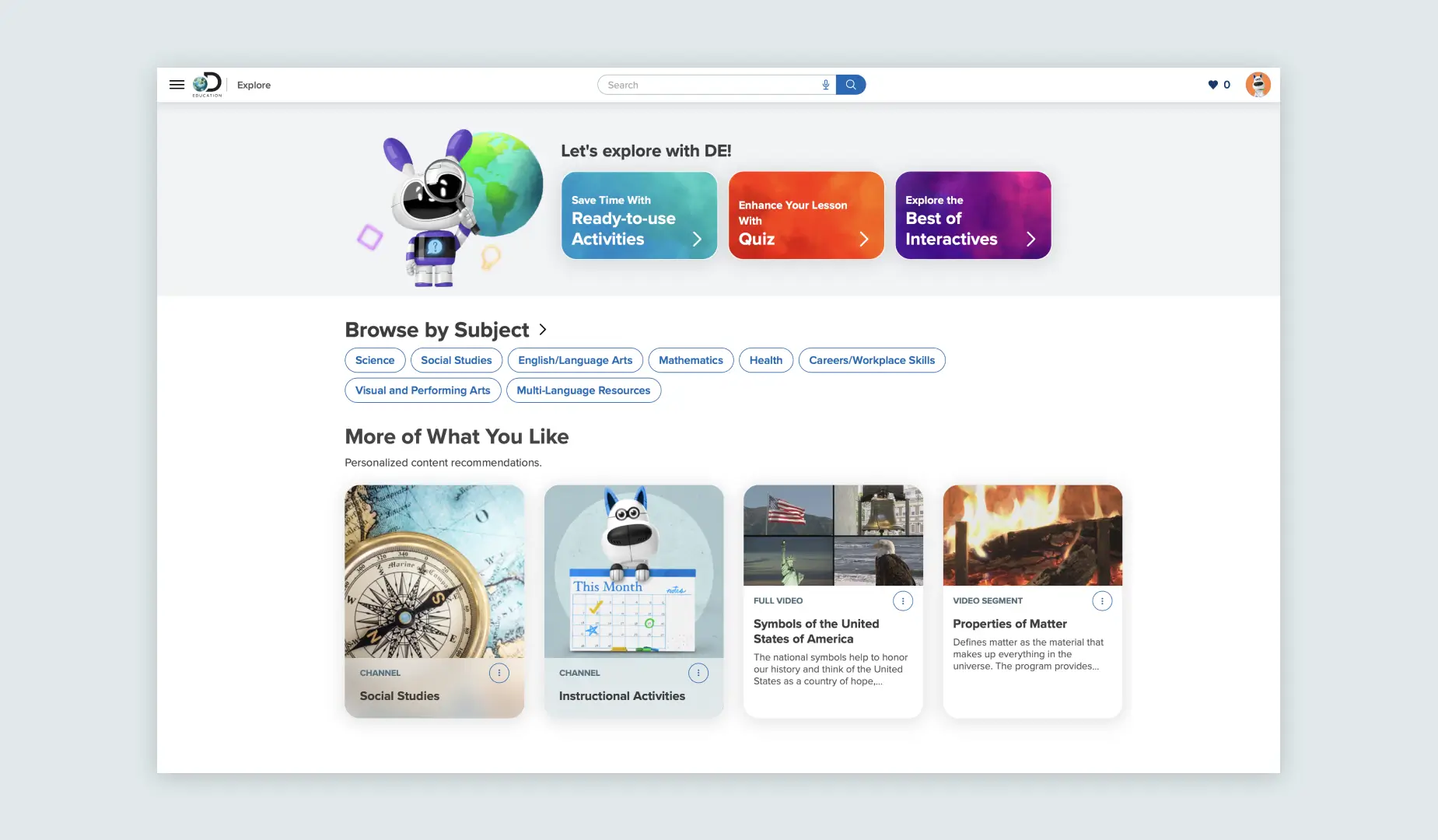
Our "Explore" section of the platform demonstrates Proxima Vara in various formats. This is done to establish a clear type hierarchy, which in combination with visual design, effectively guides the user's attention to key areas.
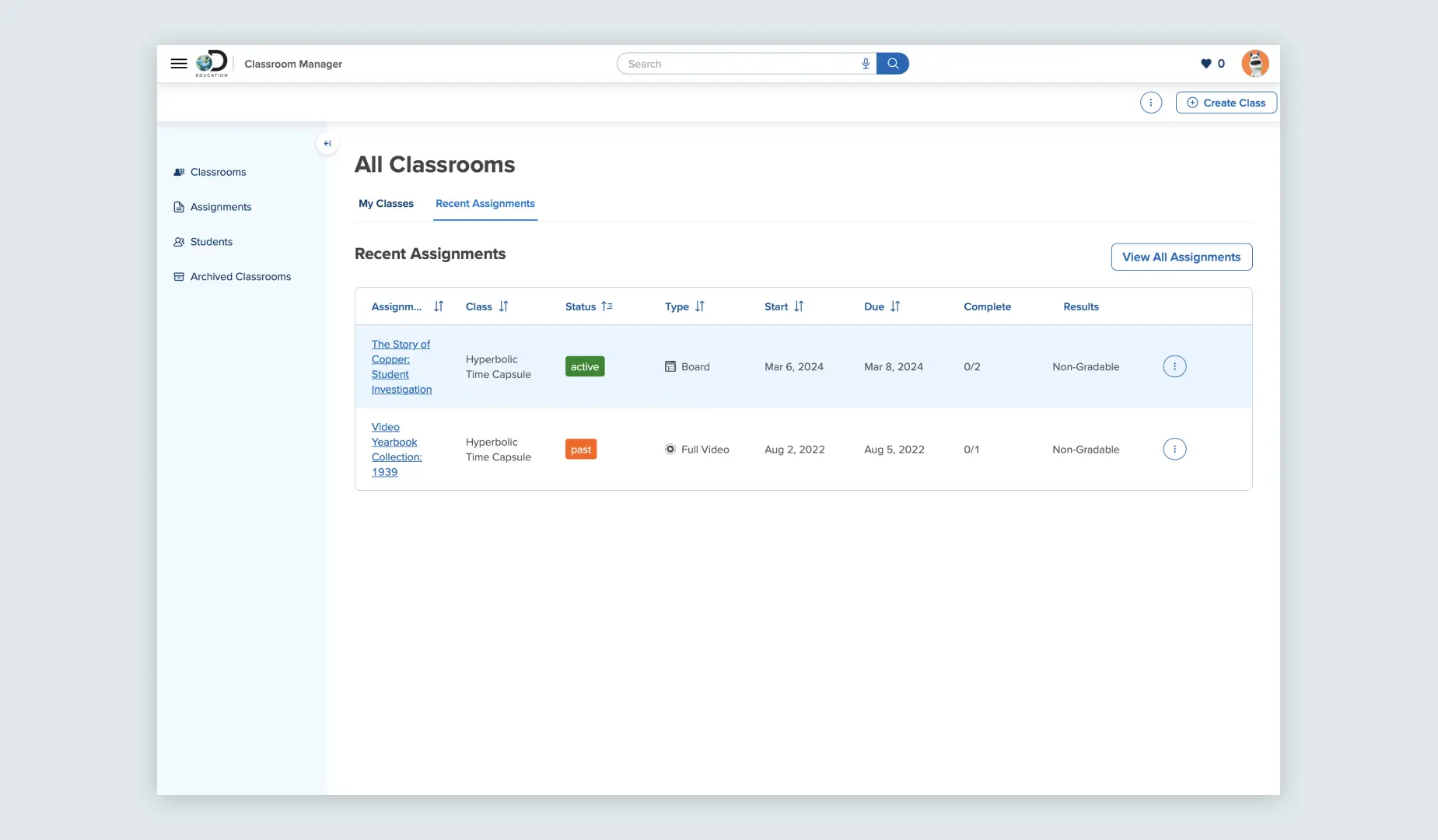
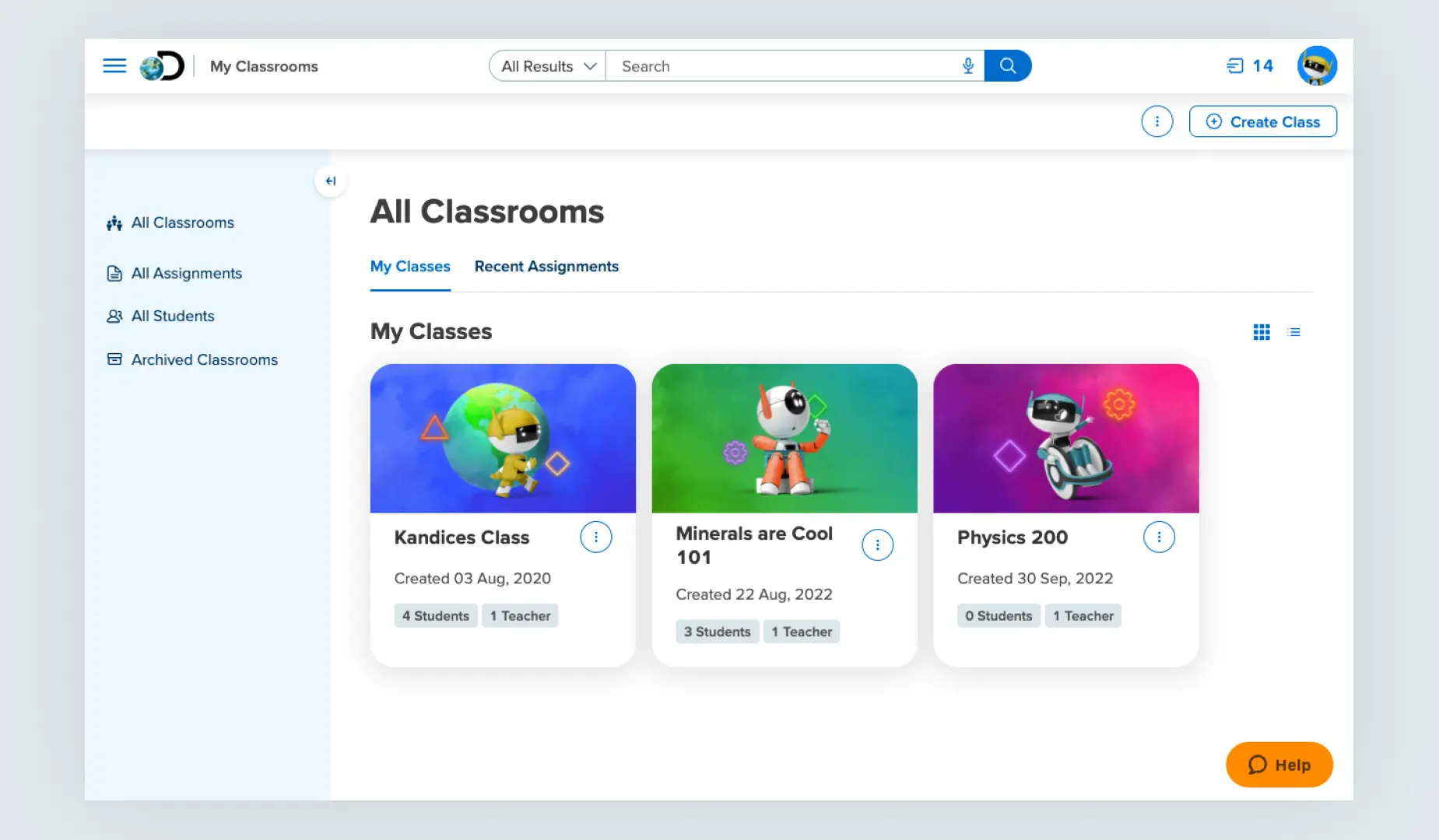
Classroom Manager uses the Proxima Vara typeface in its user interface to show key details and data about classroom management.
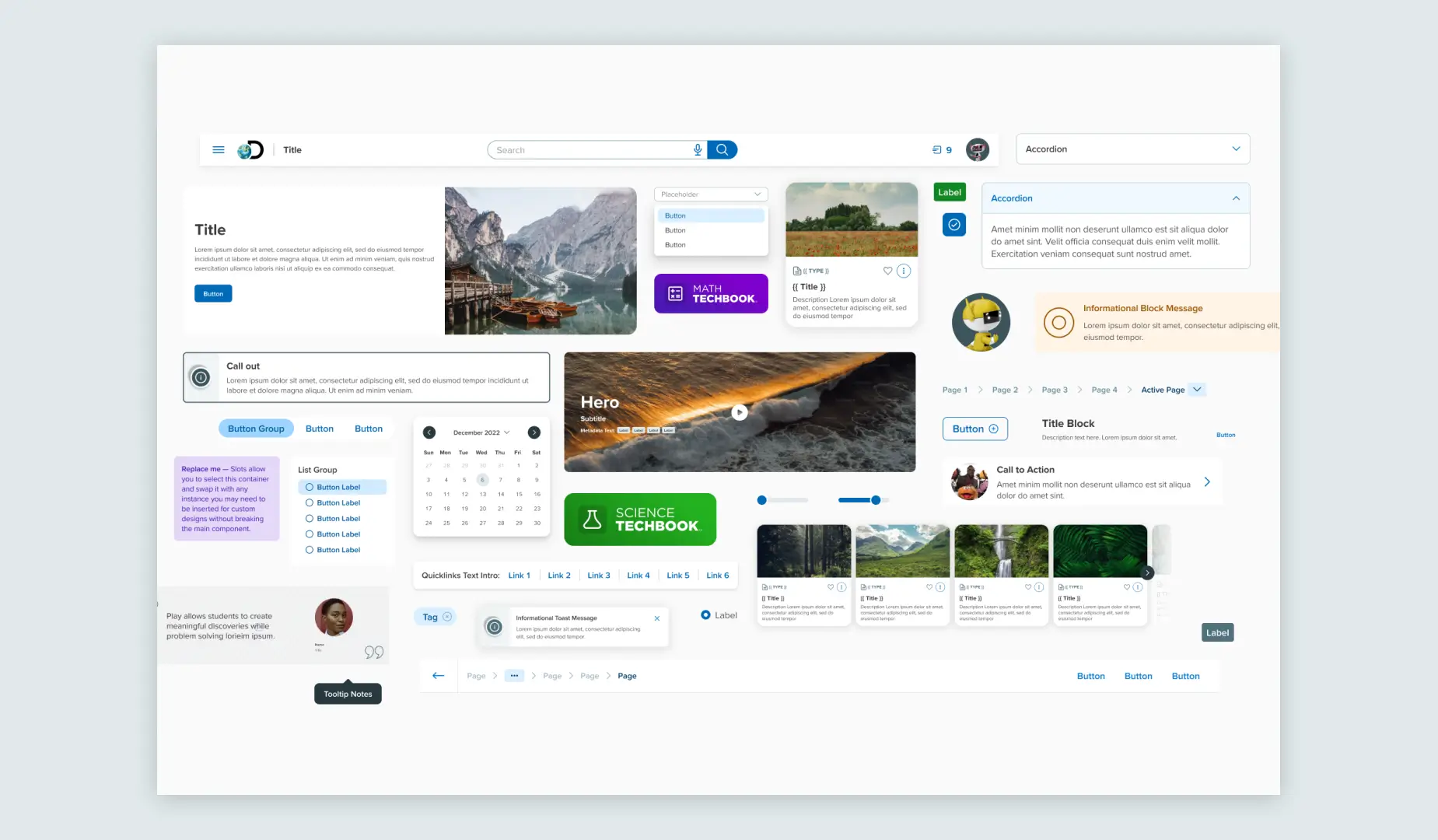
As seen, we use Proxima Vara extensively in various sizes for our Nebula Design System components. The size and weight specifications depend on the functionality of the component.
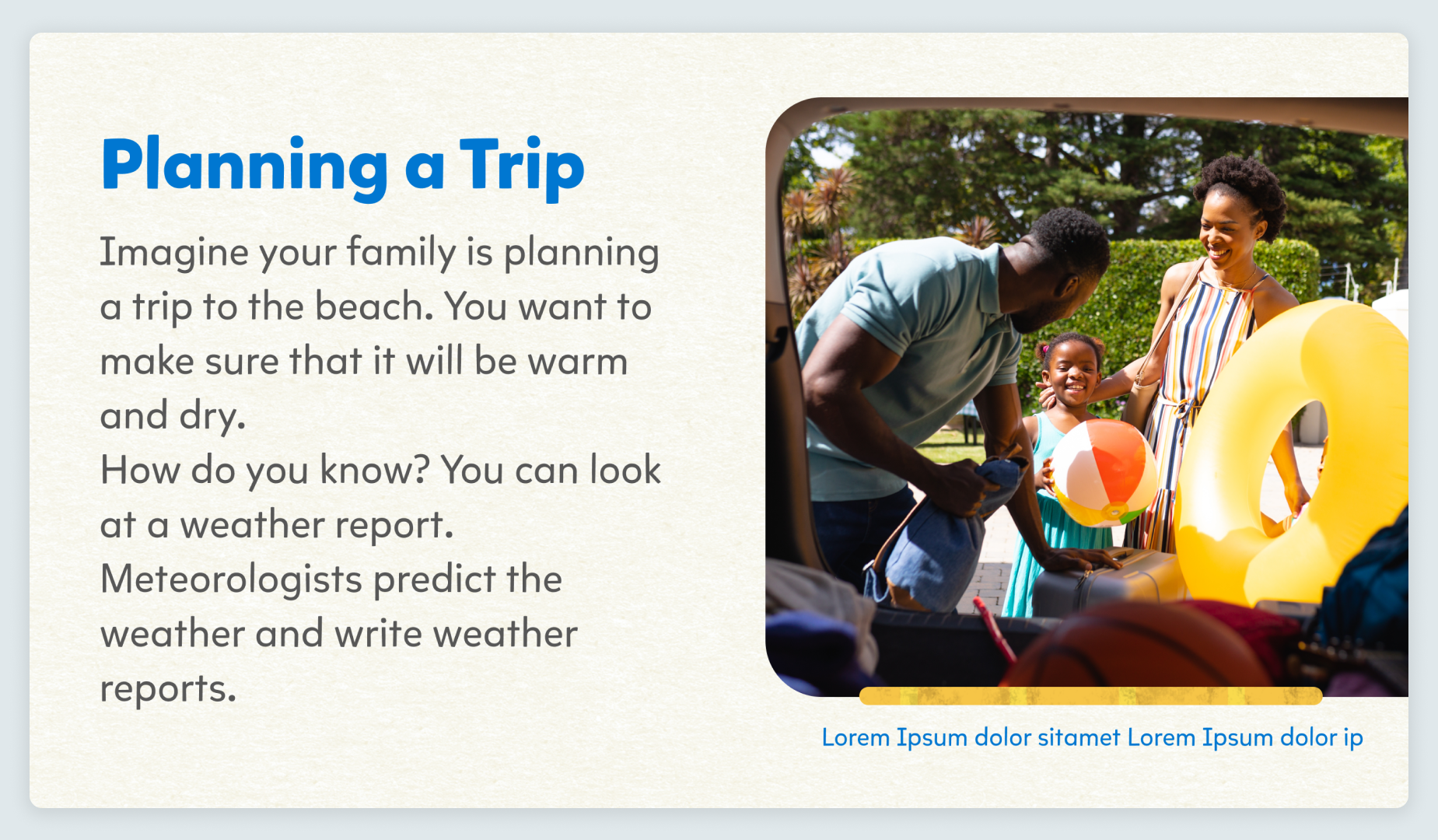
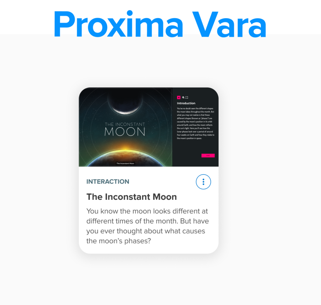
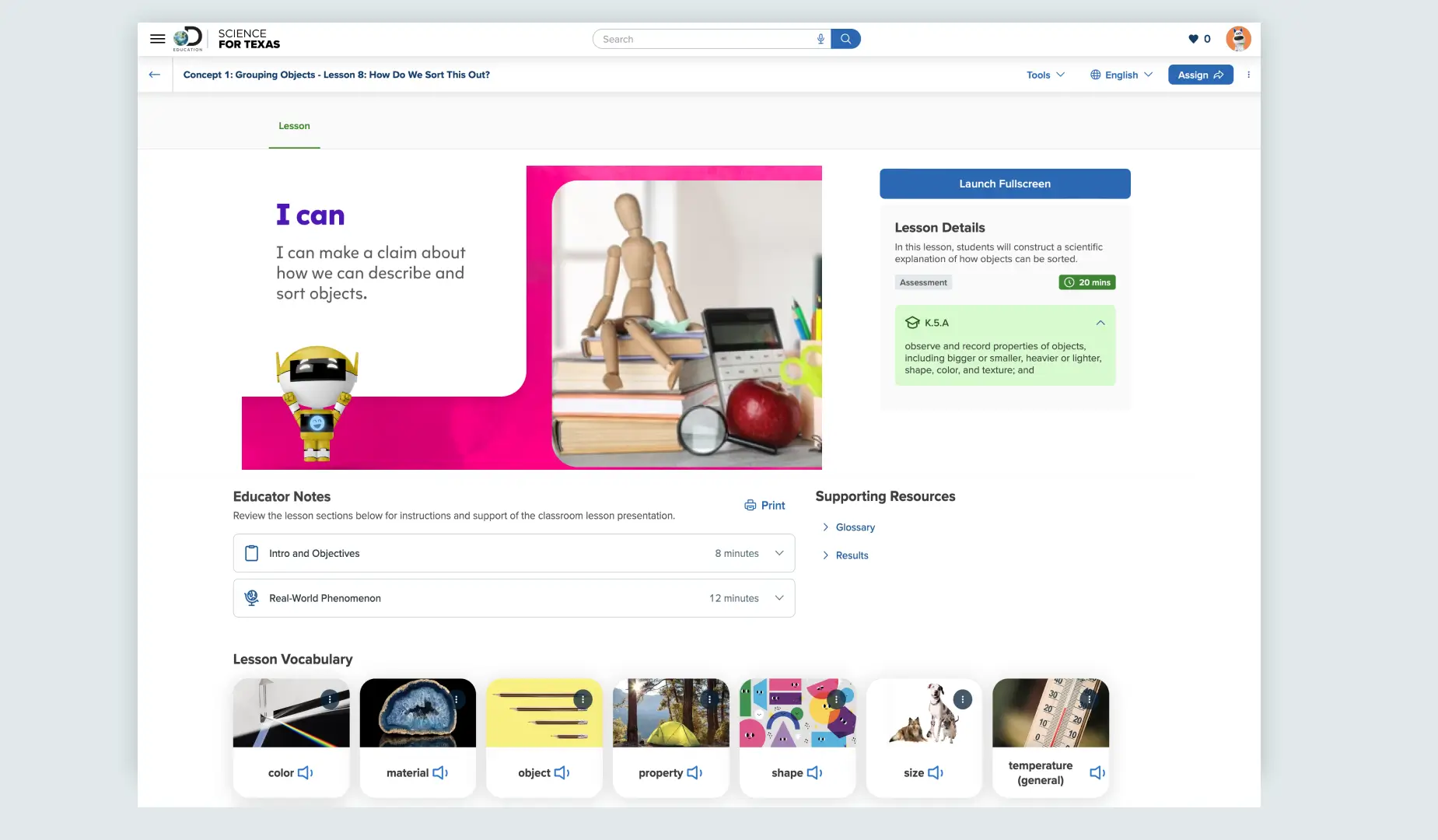
In our Techbook, we use Proxima Vara and Mikado-Chan in pairty to create an effective user interface. Proxima Vara is used to highlight key details about the lesson, while Mikado-Chan provides information about the lesson content itself.
We use Proxima Vara across different components to deliver clear and succinct information. This helps to create organized user interfaces, ensuring consistent navigation patterns.
We use Proxima Vara for the user interface in the same way as other Techbook scenarios. However, we increase the font size to cater to our audience in certain user cases.
We mainly use Proxima Vara in our platform for clear interfaces, adjusting its size for specific audiences. This typeface contributes to organized interfaces and consistent navigation.
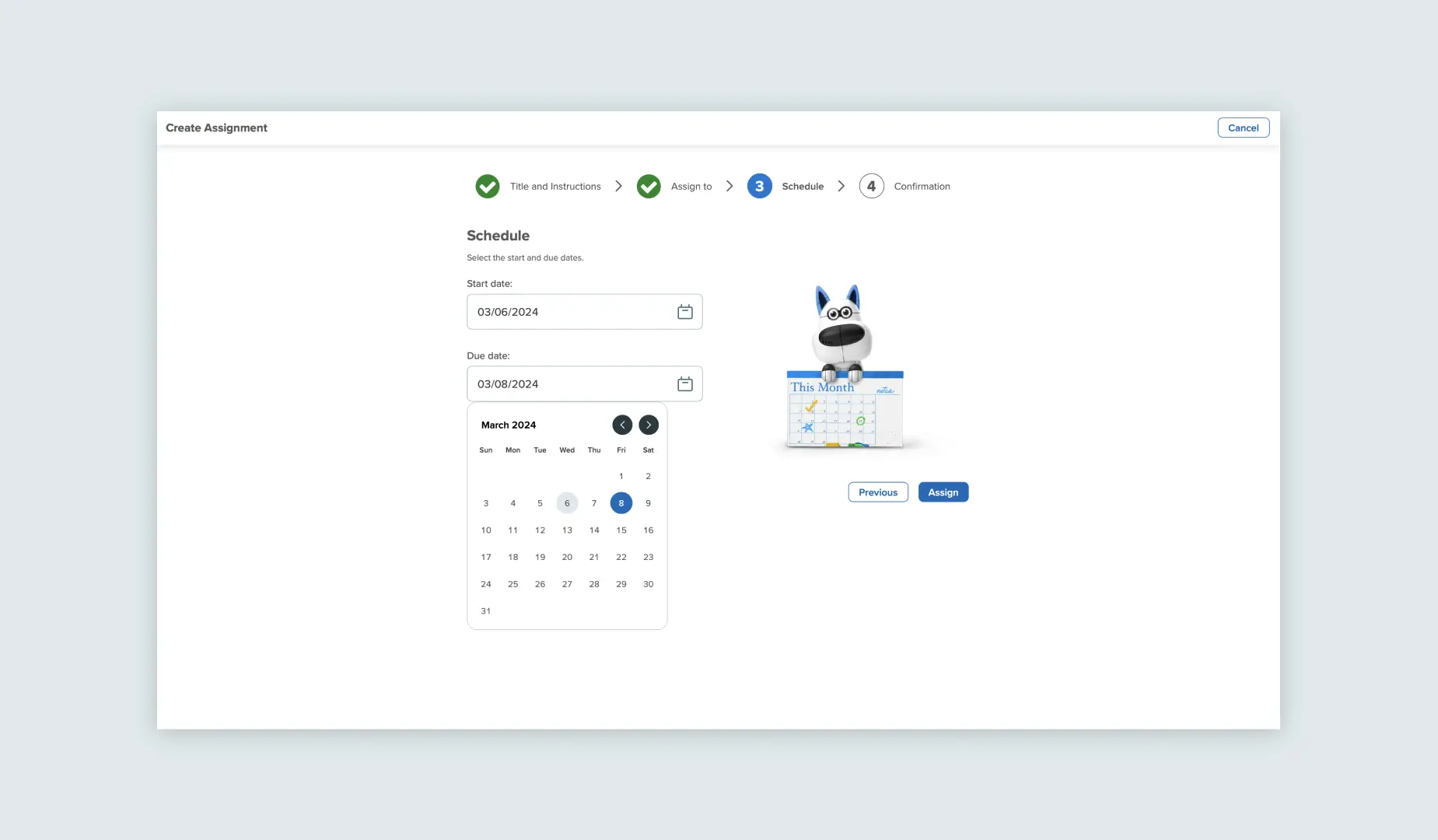
Even in streamlined interfaces like assignment creation, we incorporate the Proxima Vara typeface into our components for straightforward and efficient interactions.